The 3 Most Bearish Charts
by: Michael A. Gayed, CFA
Summary
- The tariff war is likely to cost US households $800 if it continues to escalate.
- Earnings don't look that impressive.
- Global PMI has declined for 12 straight months.
- Earnings don't look that impressive.
- Global PMI has declined for 12 straight months.
“There are risks and costs to action. But they are far less than the long range risks of comfortable inaction.”
- John F. Kennedy
As much as I’ve been negative on equities in my most recent writings, let me be very clear that I have no dog in this fight. I’m tactical in my thinking and analysis. My objective is to play the cards I’m dealt since I don’t get to choose them.
Having said that, there are several interesting data points which are worth considering for those that are of the same mindset as I am about near-term risks and divergences that could cause a Spring Crash in the S&P 500 (SPY). A few observations I made on Twitter likely will tickle your inner bear, while anger bulls. Don’t get emotional, don’t get set in your thinking.
Simply take these for what they’re worth and consider them in the context of what you hear in the news, and how you manage your portfolio.
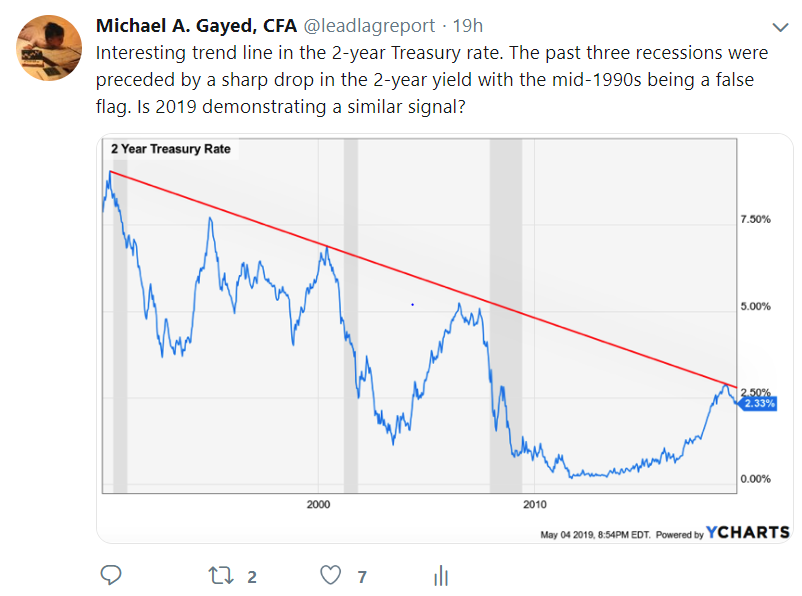
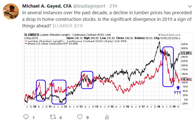
Yields matter. Interest rates are the heart, soul, and life of the free enterprise system. And while everyone seemingly got hyped about the "end to the secular bull market in bonds," if history is any guide, 2-year yields may be warning of a recession looming. This is consistent with the message coming out of Lumber and the potential follow-through in home construction stocks. Pro tip: when housing goes bad, so too tends to be risk sentiment.
Not just a US phenomenon of course. Global PMI frankly looks scary in the face of equity markets that appear on many metrics to be disconnected from reality following the December lows of last year.

Will bears ultimately be right in the near term? Or are these all false positives for risk? I have no clue frankly. All I know is that probabilities don’t favor bulls, and that gray-haired bears might be getting their dancing shoes on soon enough. Bonds, which continue to be villified, might actually end up being the hero for your portfolio if these charts are indeed a warning that something wicked comes this way.
0 comments:
Publicar un comentario