Not Enough Lifeboats: Markets Far More Dangerous Than Generally Believed
by: Kevin Wilson
Summary
- Art Cashin mentioned a metaphor in 2017 that could apply now: he said that market players had only the protection provided by pictures of lifeboats, not the actual lifeboats themselves.
- That is the current market situation in a nutshell; I would argue that the current market risk is far greater than perceived by many.
- The volatility we're seeing on some measures has not been seen since 1936, right before a 50% drop.
- Household equity exposures are still high and equity mutual fund cash positions are at record lows, margin debt is unprecedented, and liquidity is low; all of this indicates extreme downside risk.
- Prudent investors may want to hold lots of cash, plus GLD or IAU, OTCRX, WHOSX, and TLT.
RMS Titanic Had Only 16 Lifeboats (Eight Per Side), Leaving Hundreds With No Means of Escape


Famous market observer Art Cashin mentioned a metaphor in October 2017 that resonated with me. He said (words to the effect that) at that moment, market players had only the protection provided by pictures of lifeboats, not the lifeboats themselves. This is just like the Titanic (pictured above), whose measly 16 lifeboats looked nice, but left many hundreds on board with no means of escape when the ship sank. That is the current market situation in a nutshell. Players seem to believe that their positions are diversified enough to protect them in a downturn, and in any case, many appear to expect no major drawdown in spite of many months of extreme volatility. I would argue that the risk is far greater than perceived by many, and the protections most have in place are quite inadequate. There are a number of lines of evidence to support this interpretation.
For example, sentiment is still decidedly bullish, with the latest Investors Intelligence survey indicating 45% of investors are bullish and only 20% are bearish (David Rosenberg, 2018). This is in spite of investors seeing three sessions this year in which the S&P 500 (SPY) suffered 3% drawdowns against not one with a 3% gain; this condition last occurred in 1936, right before a 50% drop in 1937 (David Rosenberg, 2018; Op. cit.). For the Dow Industrials (DIA), there have been four days of 3% declines this year, with again no advances that big; this condition last occurred in 1897.
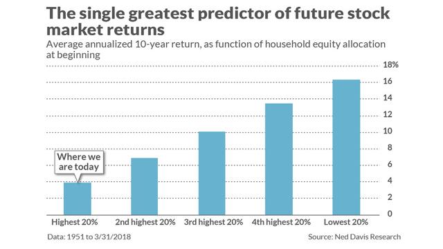
David Rosenberg also points out that households still have an extremely high exposure to equities, based on historical records going back to 1965. Data suggest that this level of exposure to equities serves as a prediction that future returns over the next decade will be below 4% annually (Chart 1: cf. Mark Hulbert, 2018).
Chart 1: High Equity Allocations Predict Low Future Returns

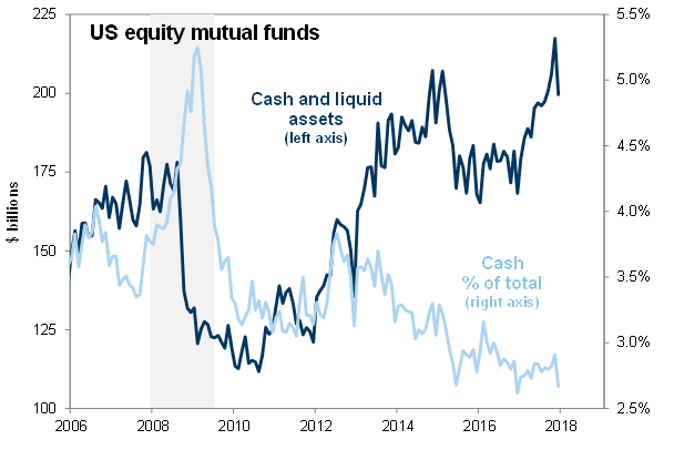
Also receiving scrutiny is the fact that the liquid asset ratio at domestic equity funds is at an all-time low of only 2.6%, well below the level seen right before the panic selling in 2008 (Chart 2).
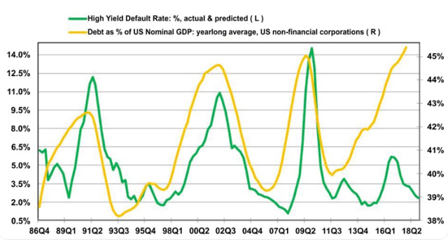
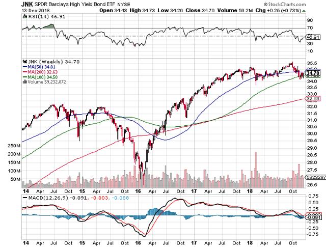
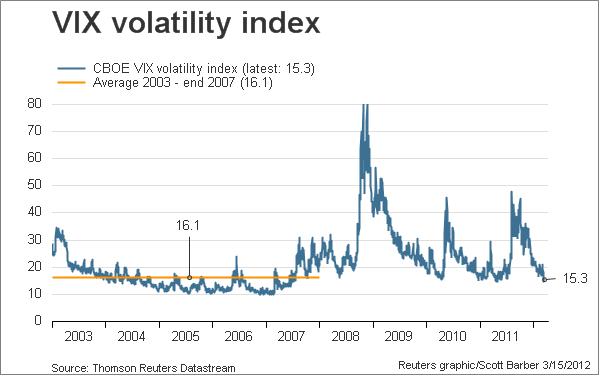
Corporate debt issuance as a percentage of GDP is at a 32-year high and has diverged very startlingly from the high yield default rate (Chart 3). These kinds of things mean revert, and we have already seen spreads widen significantly since September, thus a major sell-off in illiquid high yield bonds is on the way. Markets have only discounted junk bond funds like the SPDR Barclays High Yield Bond Fund (JNK) by 2.65% so far (Chart 4), but the downside is more in the range from -25% (2016 low) to -41% (2008 low). It is also somewhat alarming that the VIX (fear) index has only jumped from a low of 11.5 to a recent high of 24, far below the typical highs of 40 seen in cyclical corrections and the extreme high of 80 seen in 2008 (Chart 5).
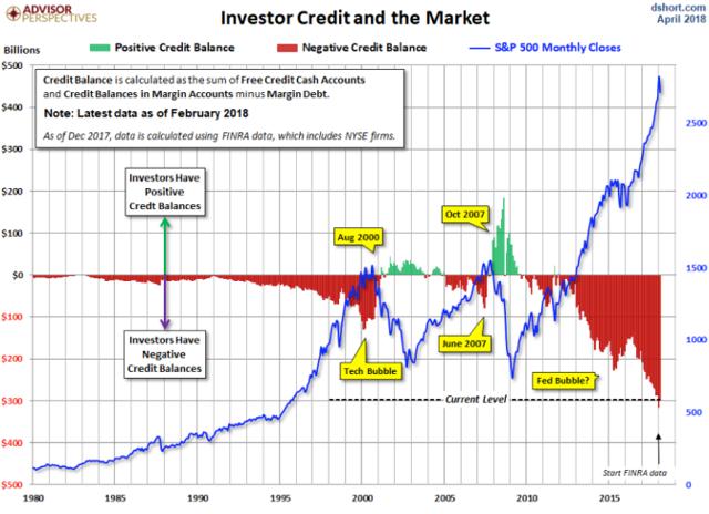
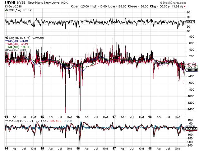
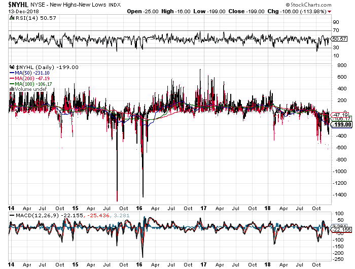
Margin debt is also at the highest levels ever observed (Chart 6), and according to Brad Lamensdorf (quoted by Shawn Langlois, 2018), this represents a huge additional risk to the markets in the event of a significant sell-off. Also of some concern is the fact that the NYSE measure of market breadth (New Highs minus New Lows Index, or NYHL) has only dropped to about -600 so far, a far cry from the -1,400 seen in 2016 (Chart 7).
Chart 2: Extremely Low Cash Positions in Equity Funds Represent High Risk for the Markets
Chart 3: Trouble Brewing in the High Yield Sector
Chart 4: Markets Have Only Discounted Junk About 2.65%

Chart 5: VIX Generally Peaks Much Higher than What We've Seen So Far in 2018
Chart 6: Margin Debt at Unprecedented Levels in Modern Era

Chart 7: NYSE NYHL Index (Market Breadth) Could Drop Much Farther
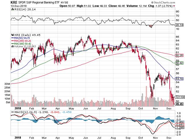
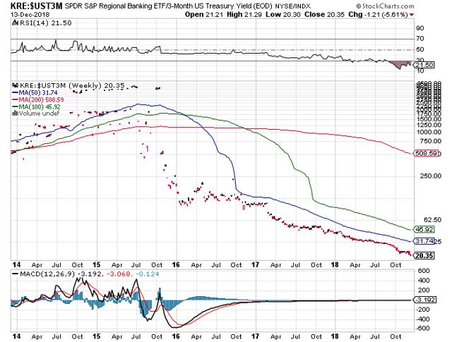
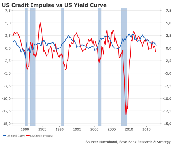
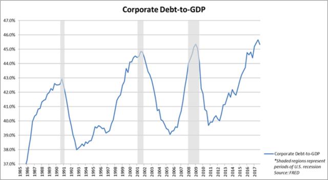
As an additional sign that all is not what it should be, notice that since September 20th, Regional Banks (KRE) are off a whopping 24% in a rising rate environment that was supposed to support better profit margins for the financial sector (Chart 8). And if we examine the ratio of the KRE index to the UST 3-month bill, we see an absolutely stupendous collapse since 2015 (Chart 9), and this ratio is still falling. The observed degree of decline for this ratio is a bit counterintuitive, and I would suggest that something is clearly wrong. Markets are not really discounting the implications of this. Indeed, the end of the credit cycle appears to be upon us, with the credit impulse (rate of change in credit) falling into negative territory (Chart 10) and corporate debt/GDP at a peak level seen only in association with the end of the cycle (Chart 11).
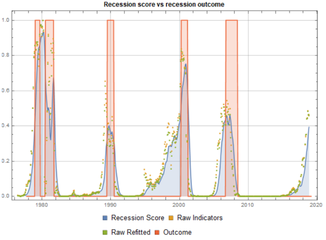
It would appear that recession cannot be very far behind, as JPMorgan Chase & Co. analysts have pointed out recently, according to David Rosenberg (2018; Op. cit.), and others have independently calculated (Chart 12).
Chart 8: Regional Banks Down 24% from the High in Spite of Rising Rates
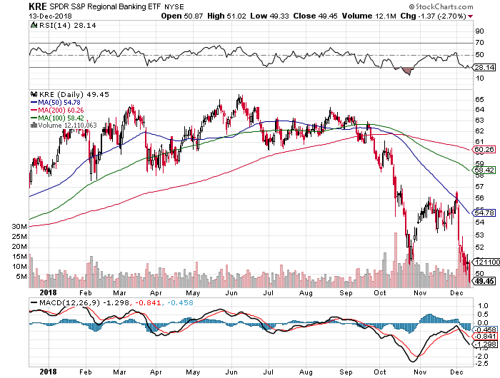
Chart 9: Regional Banks vs. UST-3 Month Down Much More Than Would Normally Be Expected
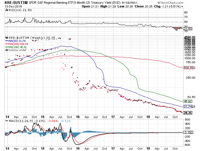
Chart 10: US Credit Impulse Now Negative
Chart 11: Corporate Debt/GDP Suggests End of Credit Cycle
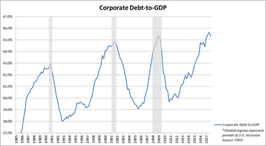
Chart 12: Recession Odds Appear to Be Surging Higher
Given all of the indicators and risks mentioned above, it would seem prudent to adopt a defensive portfolio posture, or even (for those who are very conservative investors) to go into the proverbial fetal position. In the end, I believe that those who own long-term Treasuries and gold will make a lot of money in the next 12-36 months, and those holding stocks will writhe in pain at their enormous paper losses. Allowing for human nature, most people will sell closer to the bottom than the top. A bull market for the US Treasury bond is historically the norm under these circumstances (Eric Hickman, 2018), and a strong one is likely again (Van Hoisington & Lacy Hunt, 2018). Given the current long-term sell-off from the January market high, the renewed sell-off from the October market high, and the state of certain national economies (e.g., China, Europe, Japan), it makes sense to invest some money in a gold fund like SPDR Gold Shares Trust (GLD), but only as a short-term hedging trade, not a buy-and-hold position.
The iShares Gold Trust (IAU) is an alternative ETF that may be safer for those who want to hold it for a somewhat longer period of time. But the safest form of gold in the event of a true financial apocalypse is physical gold.
Also, for those discounting a possible near-term recession and bear market, some liquid alternatives like the Otter Creek Prof. Mngd. Long/Short Portfolio (OTCRX) could be held to protect assets in the event of a much sharper market drawdown associated with deteriorating economic data. Those in a more defensive frame of mind because of the expected eventual market slide should also hold some long Treasuries, in spite of bearish arguments to the contrary, as a stock market crash would be hugely supportive of bond prices: examples include the Wasatch-Hoisington Treasury Fund (WHOSX), and the iShares 20+ Yr. Treasury Bond ETF (TLT).
0 comments:
Publicar un comentario