Flawed Assumptions and Grand Experiments
John Mauldin
Over the last few years, I have from time to time had the real pleasure of being in the presence of Lakshman Achuthan, Chief Operations Officer for the Economic Cycle Research Institute, a rather serious team of economists who spend their time researching economic cycles, especially those around recessions. They are known for having forward-looking models rather than always looking in the rearview mirror.
Every time I get around Lakshman I walk away impressed. And I always make a mental note to myself that I need to invite him to speak at my conference – but then manage to file that note somewhere where it doesn’t come up when I’m putting the speakers together. If I post this note in front of 1 million of my closest friends, maybe I’ll remember it for 2017.
Lakshman sent me the speech he presented at the 25th Annual Hyman Minsky Conference, and he has graciously allowed me to share it with you as this week’s Outside the Box.
One point he makes strongly in the initial part of his presentation is the readily observable fact that each recovery since World War II has been a little bit weaker.
And that gives me pause, because that means that after the next recession the recovery will be even more anemic than the current one has been. Thus, absent any significant policy change – and by that I most definitely do not mean the Fed’s giving us more of the same; I mean a clear-cut change in the philosophical drivers of the policy – the US economy is going to look more and more like the Japanese economy.
And that gives me pause, because that means that after the next recession the recovery will be even more anemic than the current one has been. Thus, absent any significant policy change – and by that I most definitely do not mean the Fed’s giving us more of the same; I mean a clear-cut change in the philosophical drivers of the policy – the US economy is going to look more and more like the Japanese economy.
Not that Japan is a bad place to live. Most Japanese have a relatively high standard of living, and life goes on – there’s just not a great deal of growth and all the wonderful things that happen along with that growth. So instead of actually growing its economy, Japan has piled up a huge mountain of debt, prone to unpredictable “landslides.”
I have been saying for years that the Federal Reserve is using the US economy as a big test lab for their monetary theories. This is unlike going to the doctor, where there is generally a prescribed treatment for the problem you have. The Fed is experimenting without understanding the full consequences, let alone the unintended consequences, of their policies. In the piece that follows, Lakshman very effectively criticizes not only the Fed but central banks in general for their false assumptions and grand experiments. This is a growing theme. Even Nobel laureate Joseph Stiglitz, with whose policy recommendations I frequently disagree, jumped on the bandwagon this week at Project Syndicate with a serious smackdown of the Fed, suggesting they have no idea how to create a model for the economy, and that to pretend they can create one and then prescribe policies based on it is folly.
I feel like I’m being mentally and psychologically whipsawed as I swing back and forth from looking at today’s economy to working on a book about what the world will look like in 20 years. There are many aspects of our lives that will get so much brighter – well, except for the economic part. But I think we’ll manage to work through the worst of the crisis in the middle of the next decade and can then get back to the serious business of growing our economy in a more or less normal fashion – in a world that will be anything but.
I went to the eye doctor yesterday, simply wanting to a new prescription for my reading glasses. I hadn’t been in, oh, maybe a decade. They did the usual full range of tests on me; and then when the doctor finally walked in and found that I just needed glasses and was thinking about having another round of Lasik surgery, he stopped me. “You don’t want just reading glasses,” he pronounced. “The prescription I’ve given you can be used just for reading glasses, but you probably want to get a pair of glasses you can wear all the time. And I don’t think you should get LASIK today, because your eyes are still pretty much within range; and in five years we’ll have a new technique that’s been developed in Europe that will allow us to put a lens in your eyes and then do the LASIK directly on the [I assume plastic] lens; and then if you ever need to have further work done, you can come in and we can work on that lens again.”
Wow, I just have to wait for the FDA to get around to approving something that is already available in Europe, and then I can have 20/20 vision for the rest of my life! Sounds like a major improvement to me. And there are literally hundreds of similar things in the works that will arrive in just the next 5 to 10 years. When you go out past 10 or 15 years, it truly gets amazing.
All that being said, I wonder what a slow-growth world, with the continuing technological overtake of many jobs that can be automated, will mean to the younger generation. And then I read this week about the disparity between the lifespans of the rich and poor, with the oddity thrown in that the poor in inner cities like Los Angeles live almost as long as the rich in those cities, which tells me that longevity is about more than just access to healthcare. The researchers are just scratching their heads; they can’t figure it out either. Life is just one puzzle after another. You have a great week.
Your trying to solve a 10,000-piece puzzle analyst,
John Mauldin, Editor
Outside the Box
Flawed Assumptions and Grand Experiments
By Lakshman Achuthan
Presented to the 25th Annual Hyman P. Minsky Conference, April 2016
Presented to the 25th Annual Hyman P. Minsky Conference, April 2016
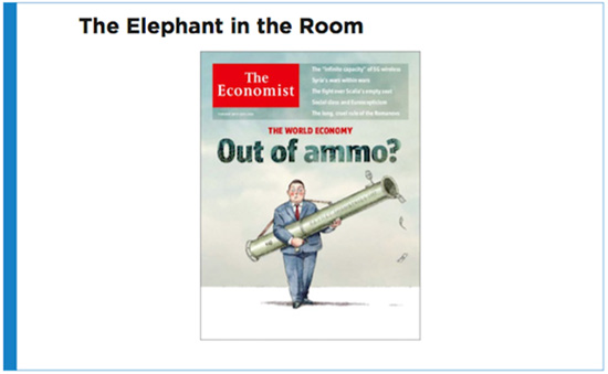
This year began with recession fears throwing a
spotlight on the elephant in the room. As the cover of The Economist put it a few
weeks back – central banks may be out of ammo to fight recession.
How and why did we get here?
As students of the business cycle we have a
perspective that is different from that of most mainstream economists. Because
of our focus on cycles, we have a good handle on what is cyclical and, by
elimination, what is not.
This is why, back in the summer of 2008,
pre-Lehman, we were able to first identify the long-term pattern of weaker and
weaker growth during successive expansions, stretching back to the 1970s. In
fact, Eduardo, your New York
Times colleague Floyd Norris wrote about our findings at the time.
In April 2009, in the depths of the Great
Recession, the talk at the London G20 conference was all about Depression, but
that same month ECRI predicted that the U.S. recession would end by the summer
of 2009. And so it did.
By early 2010, the reality of the new expansion
had engendered expectations of a V-shaped recovery, given the depth of the
downturn. As I recall, there was much talk of the so-called “Zarnowitz Rule”
invoked by the IMF’s late Michael Mussa, to the effect that the deeper the
recession, the stronger the initial stage of the revival.
Wouldn’t you know it, that quickly got simplified
to: “the deeper the recession, the stronger the revival,” dropping the key
qualifier “initial stage.”
Perhaps this simplified version gained so much
traction because it fit well with Milton Friedman’s plucking model, where he
envisioned output as a string attached to an upwardly sloping ceiling, being
occasionally plucked down by recessionary shocks; following which the string
snaps back to the upwardly sloping ceiling, again in line with the simplified
Zarnowitz rule.
The gap between these flawed expectations of
revival and the reality of growth slumping in the so-called “recovery summer”
of 2010 supported the case for what became a Grand Experiment, starting with
QE2 that fall, intended to boost the economy to “escape velocity;” in other
words, to boost the economy to a self-sustaining course, back to “business as
usual,” with long-term trend growth around 3%.
But instead of questioning those assumptions, after
years of zero interest rate policy (ZIRP) and quantitative easing (QE) failing
to achieve that objective, the Fed and other central banks kept doubling down.
So, let’s examine the assumption, is there any
relationship between the severity of a recession and the strength of the
subsequent revival?
At last year’s Minsky conference, I showed that
the conclusion we had first reached in the spring of 2009 had been vindicated.
Meaning that the first year of recovery from the Great Recession was pretty
much in line with historical experience, while, as for the rest of the
expansion, the business cycle owed us nothing more.
Let’s look at the evidence.
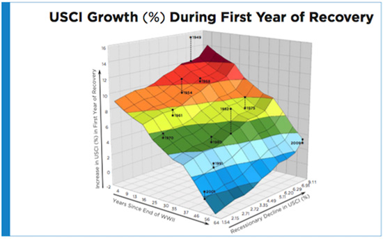
This is a regression surface that supports the
idea that the strength of the first
year of revival depends on the depth of the recession, which is
what Zarnowitz and Mussa meant, before their words were taken out of context.
The chart also shows something further. The
strength of the first year of revivals has been declining over the decades. We
use the analogy of a rubber ball that gradually loses its elasticity over the
decades. Like that rubber ball, the economy still bounces back stronger in the
initial period following deeper recessions, but with its elasticity gradually
declining, the strength of the first year rebound is diminishing over time.
The chart shows two independent variables – the
time elapsed since World War II (left horizontal axis) and the depth of
recession (right horizontal axis). Here we use a broad measure of U.S. economic
activity, which is ECRI’s U.S. Coincident Index, subsuming the aggregate
measures of output, employment income and sales.
The dependent variable is USCI growth in the first
year of economic recovery (vertical axis). The relationship among these
variables is statistically significant and explains three-quarters of the
variance in the strength of the recovery in the first year of recovery.
The regression surface slopes downward on the left
side, showing that, as years pass, the rate of growth in the first year of
expansion declines. The ball becomes less bouncy, so to speak.
The upward slope on the right side shows that,
when recessions are deeper, you then see a stronger rebound in the first year
of expansion.
The stars mark the actual strength of revival in
the first year of recovery, and the dots on the regression surface mark the
corresponding regression estimates.
I would encourage everybody to look at this chart
more closely later on, but let’s highlight the first year of recovery following
the recession that ended in 2009... where you can see that if we’d had that
severe a recession in the late 1940s, we would have expected a rebound on the
order of 14%, up here.
Also, it’s only because the recession was so
severe – all the way back here – that we managed a rebound over 3%. In other
words, if the recession had been half as deep, the expected rebound would be
less than 1% in the first year in terms of USCI growth.
At the end of the day, this chart tells us that
the size of the V-shaped recovery in the first year of revival is linked to
both the depth of the recession and the passage of time, a proxy for structural
change, which we will soon touch on.
However, following the first year of recovery,
it’s a different picture.
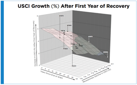
This chart is very similar to the previous one,
with the same independent variables: the passage of time and the depth of
recession.
The crucial difference is that the dependent
variable on the vertical axis is the average pace of growth during the
expansion following the first
year of recovery.
Notably, in sharp contrast to the results shown in
the previous chart, this relationship is not statistically significant, which
is why we faded out the colors.
If anything, to the extent that there is any loose
relationship, it is the opposite of what one might expect.
While the slope of the regression surface along
the left horizontal axis is still downward-sloping, the one along the right
horizontal axis is now also downward-sloping. This suggests that deeper
recessions may actually be associated with more sluggish economic growth
following the first year of revival.
That observation flies in the face of how most
people believe the economy “should” perform, but deeper recessions are
sometimes followed by weaker growth after the first year of expansion.
Basically, there is no real relationship here.
After the first year of recovery the pace of growth has little to do with the
depth of the earlier recession.
To be clear, we are not suggesting that this is a
model anybody should use to design policy.
The point is that the evidence raises considerable
doubt that, beyond the first year of revival, V-shaped recoveries repair the
damage done by deep recessions.
Furthermore, the real issue remains the long-term
decline in trend growth, which even extraordinary monetary policy efforts
cannot change.
Last June, we underscored the simple math
underlying the decline in trend growth.
As you know, labor productivity growth and
potential labor force growth add up to potential GDP growth.
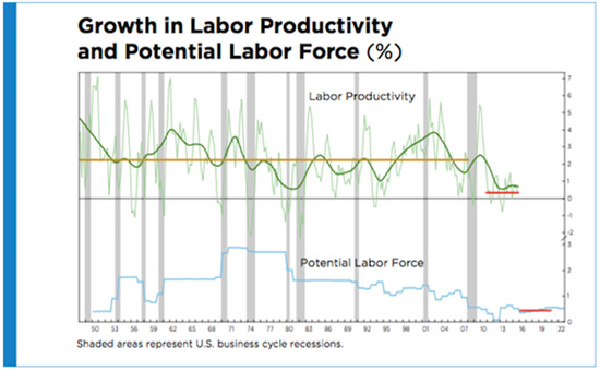
The Congressional Budget Office now pegs potential
labor force growth at 0.4% a year for the next five years, and that’s pretty
much set in stone. You see it here as the horizontal red line in the bottom
panel of the chart.
Meanwhile, productivity growth has averaged 0.4% a
year for the last five years, shown by the horizontal red line in the upper
panel. In the words of Fed Vice Chairman Stanley Fischer, it “has stayed way,
way down.”
As to where it’s going from here, Cleveland Fed
President Loretta Mester thinks it will revert to its post-WWII average of
around 2¼ percent, shown by the horizontal gold line.
Yet Mr. Fischer noted that “productivity is
extremely difficult to predict,” and only went as far as to say that it “will perhaps eventually return” to
its earlier pace (italics ours).
But if things stay around where there are, we’re
looking at 0.4% productivity growth plus 0.4% potential labor force growth,
adding up to 0.8% longer-term real GDP growth.
Potential labor force growth is just about
demographics. But if you dig into what’s driving this drop in productivity
growth, you find something interesting.
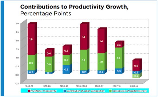
This chart shows that there has been a steady fall
in labor productivity growth and a noticeable shift in its sources of growth
over the years.
But, eyeballing the previous chart, it looks like
the post-World War II history of productivity growth has unfolded over several
phases. So it’s instructive to break up the period judgmentally, starting with the
initial 1948-73 period of relatively strong productivity growth, followed by a
slump that lasted until the early 1990s, and so on, and ending with the period
following the Great Recession and its immediate aftermath.
It is instructive to break out labor productivity
growth into growth in labor composition (the quality of labor); capital
intensity (the ratio of capital to hours worked); and multifactor productivity,
a measure of the combined influences of technological change, higher
efficiency, returns to scale, reallocation of resources, and other factors
affecting economic growth, over and above the individual effects of capital and
labor.
From 1948 to 1973, a period that saw labor
productivity growth average almost 3% per year (first bar), multifactor
productivity (red portion of bar) was the overwhelming driver of labor
productivity growth, followed by capital intensity (green portion of bar).
The contribution of multifactor productivity then
collapsed, causing labor productivity growth to fall by about half to 1½% per
year between 1973 and 1995 (second and third bars), but then rebound between
1995 and 2007 (fourth and fifth bars), basically remaining robust until the eve
of the Great Recession.
What jumps out is the period following the initial
recovery from the Great Recession (rightmost bar), where the contribution of
capital intensity went negative, after being in the ballpark of 1%, give or
take, in the entire post-war period.
So while multifactor productivity and labor
composition have been making modestly positive contributions in recent years,
that of capital intensity has turned negative despite cheap money and the
average age of private nonresidential fixed assets being near a half-century
high.
Please recall that the ratio of capital to hours
worked defines capital intensity. What’s happened is that economic growth, such
as it is, has been skewed toward growth in the number of hours worked, largely
in lower-wage service sector jobs, while capital investment has taken a huge
hit.
Basically, without a revival in capital
investment, we are unlikely to see much of a recovery in labor productivity
growth.
But notwithstanding this long-term structural
problem, the Fed is pretty close to meeting its dual mandate, right?
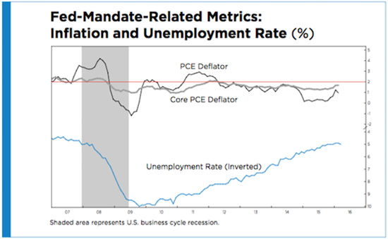
As we know, the unemployment rate has been falling
steadily for years, and is now practically at the Fed’s shrinking estimate of
the non-accelerating inflation rate of unemployment (NAIRU).
And inflation, including, in particular, the core
PCE deflator, is pretty close to the Fed’s 2% target. And yet the Fed seems
pretty “dovish.”
So what’s the problem?
One could argue that it’s what has effectively
become the Fed’s third mandate…
I don’t think it’s news to anyone that every time
the market has faltered following the financial crisis, the Fed has turned
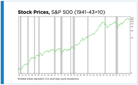
“dovish” in some way, shape or form. This chart suggests why that may be.
Perhaps it’s because the recessionary bear markets
in the 21st century, around the 2001 and 2007-09 recessions, are
bigger than any other post-World War II bear market.
If the Fed really does consider avoiding a major
bear market to be part of its informal mandate, you can understand why a
recession must now be avoided at any cost.
Or perhaps it’s not about “us,” but rather about
“them,” meaning it’s all about global growth, given that the word “global” was
mentioned 22 times in the latest Fed minutes.
If it’s global growth that’s the problem, ECRI’s
view has been for a while that we are in a global slowdown that will continue
for the foreseeable future, so it’s hard to see those concerns receding in
short order.
But for over a year, ECRI has argued that this is
about the U.S. economic cycle.
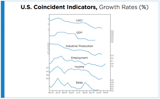
Sure we’ve seen relatively decent job growth. But
year-over-year (yoy) growth in nonfarm payroll jobs has been trending down
since early 2015.
And, as you see, so has GDP growth, even without
Q1 data.
Meanwhile, yoy industrial production growth is
also trending down, and remains near a six-year low.
You can see similar downtrends in yoy income and
sales growth, which are around 1½- and 2-year lows, respectively.
That’s why growth in the U.S. Coincident Index
(USCI) has been falling rather steadily since the start of 2015, and is now
hovering near a 2-year low. By the way, this is the same measure of economic
growth used in the earlier regressions.
These concerted declines in output, employment,
income and sales growth, resulting in a USCI growth downturn, constitute the
hallmark of a growth rate cycle downturn, meaning a full-blown cyclical
slowdown, on top of the long-term structural decline in trend growth.
Understanding this, we warned last summer that the
Fed’s rate hike plans were on a collision course with the economic cycle.
So the Fed started its rate hike cycle a year
inside a growth rate cycle downturn, something it has never done before. This
may be why the Fed is having trouble following through on its rate hike plans,
even though its dual mandates have essentially been met.
Under these circumstances, can the Fed hike rates
much further?
In fact, will they actually have to backtrack and
cut rates the way the European Central Bank (ECB) did in 2011?
Let’s look at the circumstances under which the
ECB and the Bank of Japan (BoJ) reversed their last rate hike cycles, in terms
of ECRI’s Eurozone and Japanese Long Leading Index growth rates.
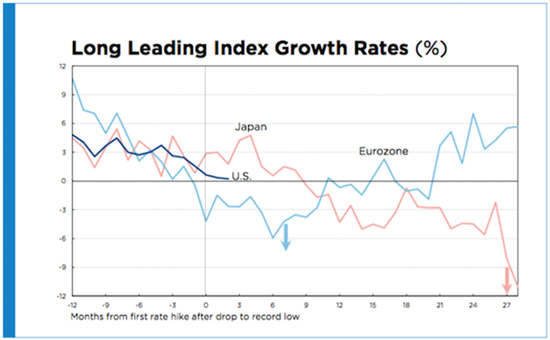
The light blue line is the growth rate of ECRI’s
Eurozone Long Leading Index, and the vertical black line shows where the ECB
started hiking rates in 2011.
The blue down arrow shows where they had to
reverse course and cut rates just seven months later, after Eurozone Long
Leading Index growth had plunged deep into negative territory.
The red line shows Japanese Long Leading Index
growth, beginning in the mid-2000s, and the vertical black line once again
shows where the BoJ started hiking rates in 2006.
Japanese Long Leading Index growth actually
improved for a bit, before starting to sink, and it was not until 27 months
after the first rate hike that the BoJ reversed course and cut, as shown by the
red arrow, following a plunge in Japanese Long Leading Index growth.
Now, the shorter, dark blue line shows current
U.S. Long Leading Index growth, with the black vertical line marking off the
timing of the Fed’s December 2015 rate hike.
It’s interesting to see that it’s right in-between
the other two, and while we’ll have to wait and see how it evolves, the chart
suggests a reasonable chance that the Fed will find itself backtracking. But
what does that look like if you’re out of ammo?
The point is that, for central banks in general,
credibility is the most important asset, and even for the Fed, this next chart
raises questions.
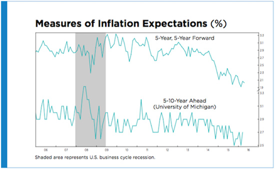
Here we have both the market-based and
survey-based five-to-ten-year-ahead inflation expectations hovering around
record lows.
It is notable that these numbers are much lower
than during the Great Recession, but what’s remarkable is how much they’ve
dropped since 2014.
This is about the Fed’s credibility in keeping
inflation around its target, not in the next few years, but in the next decade.
To cite St. Louis Fed President Jim Bullard, these inflation expectations are
“a rough measure of Fed credibility with respect to its 2% inflation target.”
Yes, there’s been a good correlation between crude oil prices and 5-year,
5-year forward inflation expectations, but it may have persisted for a reason.
It may be because a plunging oil price could threaten lenders to energy
producers and jeopardize the financial system. Simultaneously, falling oil
prices may be seen as a symptom of rising recession risk, while also increasing
the probability of deflation that naturally boosts real interest rates,
stymieing the Fed and making monetary policy less potent. Of course, anytime
the Fed’s perceived impotence increases, so does the disbelief in its ability
to meet its inflation target, even in the longer run.
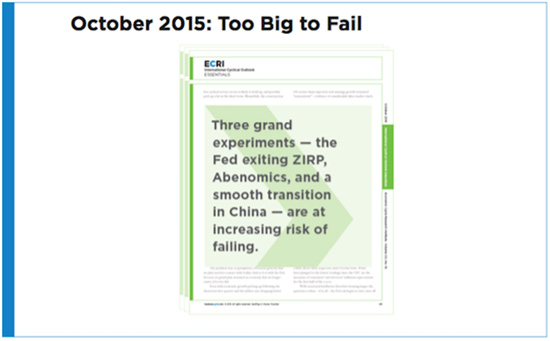
And this is not just about the Fed, which
undertook a Grand Experiment of an extended ZIRP and QE. There are actually
three grand experiments that are too big to fail, and yet they are at risk of
failing.
Following the Global Financial Crisis, China
launched not only massive monetary easing, but truly colossal fiscal stimulus
that included pouring nearly one and a half times as much concrete in the three
years ending in 2013 as the U.S. had in the entire 20th century. The
resource bust that followed has sent deflationary shockwaves around the globe,
and the repercussions are not over yet.
Years of robust growth had fostered the belief
that China was led by infallible technocrats who always knew what levers to
pull, and when. But their handling of the stock market crash and exchange rate
volatility since last summer undermined confidence in China’s ability to pull
off a tricky transition to a consumer-driven economy, even though they’ve
calmed market jitters for the moment. Please recall, the latest Fed minutes
mentioned the word “global” 22 times.
We’ve talked about the Fed’s predicament, but the
real issue is the fear that, in the event of another recession, the U.S. will
essentially “become Japan.” Hence the concern about falling long-term inflation
expectations.
But if you do “become Japan,” Abenomics was
supposed to be the way out. Yet after three years, Abenomics is clearly
failing, with GDP falling in five of the 12 quarters since its launch. Two
years ago, Japan had its fourth full-blown recession since 2008, and last year
it had negative GDP growth in two of four quarters. Looking ahead, we’re
monitoring the risk of yet another Japanese recession in 2016, which would be a
deathblow to Abenomics.
This is quite a global predicament to be in after
years of unprecedented stimulus.
In the summer of 2008, before Lehman blew up and
many years before the secular stagnation debate, we showed that the pace of
expansions had been stair-stepping down since the 1970s.
We’ve also shown why the case for a strong
recovery beyond the first year following a deep recession is not supported by
the evidence, as we had originally concluded way back in 2009.
Therefore, the discourse among policymakers,
trying to explain their disappointment and prescribe additional solutions, has
been based largely on flawed assumptions that trend growth was actually higher
than it’s turned out to be, and that we were somehow owed a return to that
long-term trend.
As a result, policy initiatives designed to blast
the economy toward “escape velocity” wound up being not only misguided, but
also futile.
As Sherlock Holmes observed in “A Scandal in
Bohemia,” “It is a capital mistake to theorize before one has data. Insensibly
one begins to twist facts to suit theories, instead of theories to suit
facts.”
We would submit that the first step in correcting
this mistake is to restart the theorizing from a closer look at the evidence.
And we would also heed the advice of another
well-known investigator. Carl Sagan used to say that “extraordinary claims
require extraordinary evidence.”
Similarly, if you’re going to embark on Grand
Experiments, you’d better make sure that your assumptions are rock-solid. But
as we’ve shown, there should have been serious doubts about some key
assumptions underlying central bank policy.
Ultimately, only policies that genuinely address
the challenges of demographics and productivity have a chance to succeed.
Meanwhile, the notion that the Fed can indefinitely forestall the 48th
recession in U.S. history remains wishful thinking.
0 comments:
Publicar un comentario