Data-Dependent ... on Imaginary Data
Federal Reserve officials like to say their policy course is
“data-dependent.” That sounds very cautious and intelligent, but what does it
actually mean? Which data and who’s interpreting it? Let’s ask a few questions.

Photo: Federal Reserve Board of Governors
First, how could their policy choices not be data-dependent? The only alternatives
would be that they made decisions randomly or that there was an a priori path already
determined by previous Fed policymakers that they were forced to comply with. A
predetermined path would, of course, eventually be leaked, and then everybody
would know the future of Fed policy. Until they changed it.
Of course, they do depend on data, and lots of it, but are they
looking at the right
data? If it is the right data, theoretically speaking, is it accurate? As we will see,
more often than not they are basing their decisions on data created by models
that rely on potentially biased assumptions derived from past performance, etc.
Often the data they look at is actually a sort of metadata, a kind of
second-derivative model, with all sorts of built-in assumptions, quite removed
from the actual data.
That approach is actually reasonable when you realize that the
amount of data that must be managed is simply too large for any human being to
process in a coherent manner. The data has to be massaged, and that means
making assumptions that create the models in the programs. Those are
assumptions are not made by computers, they are made by human beings who are
doing the best they can – using models based on assumptions they build in to
guide them as to what assumptions they should make about the data. Convoluted?
Yes.
I certainly don’t know all the answers to the problems with
national and global economic data and metadata management, and it’s far from
clear the Fed knows those answers, either. Whatever your economic and political
ideology, we can all agree that these are big problems. Today we’ll look at how
big.
First, a quick update on the Strategic Investment Conference. This
is especially for the many of you who wish you could attend but have conflicts.
For you, we have something new: the SIC Live Stream Virtual Pass.
Video coverage for all the conference sessions will be
streamed live over the internet straight to your
computer or mobile device! It’s not quite like being there, but
it’s darned close.
The technology to do this is quite expensive, as you may imagine.
We’re making the investment because this year’s message is so important. Our
theme this year is “Crossroads” because that’s exactly where the world is. We
are at an inflection point and have big choices to make. Right ones will speed
us along. Wrong ones could slow us nearly to a halt.
We are actually approaching multiple crossroads simultaneously.
You know the list: In addition to the Fed, other central banks are on the cusp
of big policy shifts, too. Geopolitical challenges are cropping up everywhere,
and some big emerging-market countries are on shaky ground.
We’ll be exploring those crucial issues and more at SIC with 25+
top experts. If you can’t join us in San Diego, the Live Stream Virtual Pass
will bring the conference to you. You’ll see all the sessions and even be able
to submit questions to the speakers.
I’m doing this because I want every reader to have every
opportunity to get ready for what’s coming. The SIC
Live Stream Virtual Pass will be your ticket, and at a very
reasonable cost.
Here’s a garden-variety mainstream media market narrative right
now. I made this up, but similar thoughts are voiced everywhere.
US growth is finally taking off after years of
stimulus. We’re near full employment, and wages are starting to rise. Consumers
are opening their wallets just as tax cuts and deregulation embolden business
to expand. At the same time, we are hitting resource constraints that have the
economy close to maximum output. The resulting concern about inflation is
pushing interest rates higher and taking some froth out of the stock market.
There are a lot of people who agree with this narrative,
especially those who talk to us via the mainstream media. The problem with that
story is that they are assuming facts that aren’t necessarily proven, two in
particular:
• We’re nearing full employment.
• The economy is close to maximum output, or “potential GDP.”
Are those statements correct? How do we know? How do we even define full employment and
maximum output? Measuring them isn’t like sticking a thermometer in your
holiday prime rib to see how it’s cooking (which, by the way, if you are
serious cook, you absolutely must be doing).
I thought about this problem with definitions last week when I
read a Washington Post
op-ed by Jared Bernstein. He was the chief economist for Vice President Joe
Biden and now works at a left-of-center Washington think tank. He’s also not
someone I would normally quote, since we are on quite different policy ground
politically and economically. But we also have some common ground, and I think
it’s important to note that. And for the record, more and more economists of
all stripes are beginning to come around to this very same view.
But Jared does
a particularly good job in a brief space of framing the issues. Here’s the lead
to Jared’s
article.
Recent events have exposed a hole in the middle of economists’
knowledge of key economic parameters: We
know neither the unemployment rate at full employment nor the potential level
of gross domestic product (GDP).
That hole is particularly important right now. The combination of
the deficit-financed tax cut and the new spending bill are pumping hundreds of
billions into an economy that many argue is already at full employment. If so, then much of this extra spending
won’t lead to new investment, jobs or higher real pay. When the
economy’s human and capital resources are fully utilized (meaning actual GDP is
equal to potential GDP), fiscal stimulus just generates inflation and higher
interest rates. Even if the extra demand might create some wage pressure, it
will be met with higher inflation, so real wages – the paycheck’s actual buying
power – won’t change at all.
The problem is that those making that argument are implicitly
asserting that they know that the “natural rate of unemployment” – the lowest
rate consistent with stable inflation – is roughly equal to the current
unemployment rate. That is, they believe we’re at full employment. But the
truth is they have no way
of knowing that, and one key indicator – inflation – suggests
they may be wrong.
Those are three paragraphs that I could have written and defended.
I think that fact is significant. Jared and I more than likely to disagree on
what economic policies we should follow – but we can’t even have that argument
until we can agree on what the data says and means. And we can’t at this point.
We have to rely on anecdotes and hints, at best.
This state of affairs is startling once you start thinking about
it. Economists are reaching conclusions and policymakers are making decisions
based on derivatives of invisible derivatives.
Sound crazy? Yes, but it’s happening.
Let’s talk about these two stats, full employment and potential
GDP. They have multiple layers.
“Full employment” means all the people who want to work are
gainfully employed. For the record, the Fed thinks that full employment is an
unemployment rate of about 4.7%, while the BLS tells us that unemployment is
currently running at 4.1%. Those who aren’t working are either in between jobs
or face some barrier, like a criminal record or lack of skills.
Therefore, if
we are indeed close to full employment, employers who need more help must offer
higher wages, which leads to inflation. At least that has been the pattern
historically.
But is it really that simple? In any given month, we have only a
rough approximation of how many people are unemployed and an even rougher idea
of how many might become employed but are currently not even looking. The
numbers come from survey data, with all the inherent limitations surveys
entail. There are actually two different federal surveys, and sometimes they
disagree wildly. Over time they get in line, but on a month-to-month basis?
Not
so much. Beyond those surveys, what we think we know is mostly conjecture and assumptions
about what we want the data to say.
For instance, simple observation and the actual surveys suggest
that many Americans, while nominally employed full-time, aren’t earning as much
as they once did. Nor are they as productive as they once were or as they could
be. If that’s a widespread pattern, it means the economy still has “slack.”
Production could rise significantly without adding any new workers. What we
have is not “full employment” in any real sense.
We use survey data to infer how many people are employed, how much
they are paid, and so on. In the process we observe people who aren’t employed. We try to
figure out why they don’t have jobs and what circumstances might bring them
back into the labor force. It’s a many faceted mystery no one has solved, yet
we make important policy decisions based on our fragmentary understanding of
that mystery.
Let’s look at a few different ways to measure what we mean by full
employment. The Bureau of Labor Statistics (BLS) suggests that if you
haven’t been looking for a job in the last 30 days, you are not in the
workforce. Thus you don’t count as unemployed.
First off, that way of defining unemployed
runs contrary to all of our personal experiences. There are lots of people who
have not been able to find a job and have given up looking, but if they were
offered a decent-paying job they would take it.
Choosing to say that they are
no longer in the labor force after just 30 days of not looking seems rather
arbitrary and unrealistic to me.
Now let’s take a look at the US labor force participation rate
since 1990 via the St. Louis Fed’s FRED database:
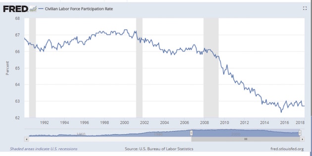
There are a lot of reasons for the participation rate to have
fallen so much, and the dropoff is an extraordinarily complex and difficult
thing to get your data head around. But policymakers and economists want to have
simple answers and solutions, so they make assumptions and then confidently
tell us that their assumptions are the correct ones: This is what the data
means. And they don’t bother to attach a 50-page white paper that parses all of
the different variables that go into making those assumptions about the
participation rate.
Just saying…
My friend Lance Roberts (via Michael Lebowitz) adjusts the
unemployment figure based upon a methodology that includes the people who have
quit looking for jobs. He compares that adjusted rate to the U3 rate in the
chart below.
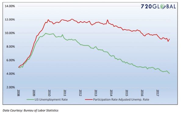
Is Lance’s number the real
employment rate? I would suggest that it’s not, because a lot of people who are
not in the labor force really aren’t looking for jobs. They are students, or
they are on disability, and so forth. Lance performed the exercise to
make us think about the employment numbers.
If you argue that we are at “full employment,” then it follows
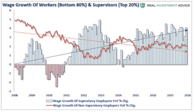
that you are expecting wage inflation. But that is not what we’re seeing.
Eighty percent of workers are seeing very little wage growth at all. This
instructive chart comes from my associate Patrick Watson’s latest Connecting
the Dots letter:
For there to be demand-led inflation, consumers need to actually
have some of that wage growth in order to be able to spend more money. Yet real
savings as a percentage of disposable income is down to just above 2%, a long
way from the long-term average of 8%. And credit card debt is still rising
while disposable income is flat.
Let’s hear from my friends at 720
Global:
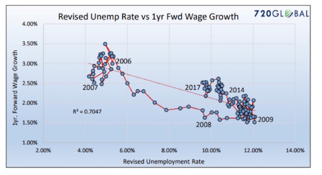
The first graph below shows the traditional Phillips curve as
typically displayed (U-3 and recent three-month wage growth). The second is a
modified Phillips curve which uses the revised U-3 from above and one-year
forward wage growth.
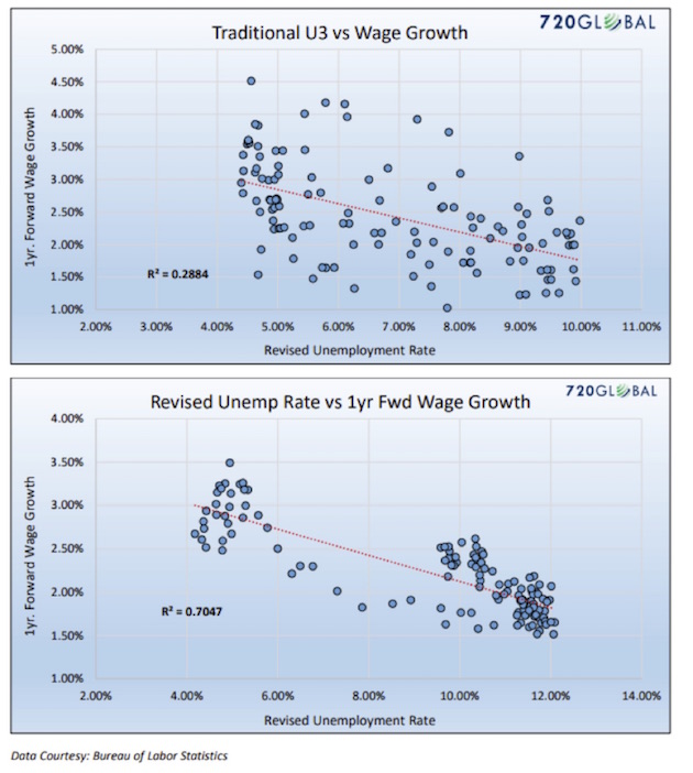
Both graphs … demonstrate that only 28.84% of the change in wages
was due to the change in the unemployment rate. Visual inspection [of the first
graph] also tells you the relationship between wages and unemployment is weak.
It is this graph that has many economists declaring the Phillips curve to be
irrelevant. The second graph has a (warning: economic geekspeak) statistically
significant R² of .7047 and a visible confirmation that the Phillips curve
relationship continues to hold. Recently, Federal Reserve Bank of Chicago
President Charles Evans stated, in relation to the Phillips curve, “We don’t
have a great understanding of why it’s gotten to be so flat.” Mr. Evans,
perhaps employment is not as strong as you and your Fed colleagues think it is.
720 Global goes on with more math before they produce this
important graph:
If one believes that the laws of supply and demand continue to
hold true, then the revised Phillips curve graph above argues that the
unemployment rate is in reality much closer to 9% than 4.1%. To believe that
the Phillips curve is useless, one must be willing to ignore a more rigorous
assessment of labor market and wage data. The only reason economists and Fed
officials voluntarily ignore this data is that it belies the prettier picture
of the economy they wish to Paint.
Does anyone else see a problem here? Those who crunch the data see
what they want to see and disregard the rest. If you want to see low
unemployment, you find data that gives you low unemployment. You don’t look at
contrary measures.
The Fed has taken this position in spite of the fact that most Fed
economists truly believe in the Phillips curve. They just don’t believe in it
enough to take it to its logical conclusion, as 720 Global did.
Then there’s “potential GDP,” or the nation’s theoretical maximum
noninflationary output. What does it tell us? First, note that we barely have a
grip on actual
GDP, even though it is a function of (mostly) observable data. A small army of
people spend their entire careers collecting GDP inputs. They do a fine job,
too; but no one really knows if they are collecting the right data to support
the conclusions everyone draws. Further, GDP does not measure all the things
that we used to buy at significantly higher prices, which contributed to GDP
but are now (for instance) available in our phones for “free.”
I have spent entire letters talking about the limitations of GDP
measurement. I thoroughly understand why we must have the measure, but we need
to recognize what it is and isn’t. It is not a meaningfully, accurate number
delivered from Mount Olympus by the economic gods. It is, at best, a
concatenation of approximations, the movement of which, based on those
approximations, can give us insights into the economy – but not with any real
precision. Google Maps gives you very precise directions. The GDP number is more
like “We are going west; we are not going north.”
We then use this estimated GDP, this fuzzy and incomplete growth
measure, to infer potential
GDP, or how high this nebulous number could go if some of its inputs changed.
Then we wonder how close we are to this vague derivative of an incomplete
measure of a hypothetical construct, so that we can modify fiscal and monetary
policies. It’s important to understand that if we have in fact now begun to
exceed our potential GDP, then economic theory suggests that inflation – and
perhaps not even mild inflation – is right around the corner. I am not a
doctorate-holding economist, but to me this seems an unwise assumption to make.
Others think so, too. Here’s Jared Bernstein again:
It’s true that influential institutions such as the Federal
Reserve and the Congressional Budget Office (CBO) believe that the “natural”
unemployment rate is above the current one, meaning our labor force is beyond
fully employed. Their estimates are 4.6 percent and 4.7 percent, respectively,
while the actual rate is 4.1 percent. The CBO also asserts that our current
level of GDP – $19.7 trillion – represents full capacity.
But the evidence undermines much confidence in these
authoritative-sounding point estimates. First, understand that neither of these
measures – the natural rate or potential GDP – can be observed. They must be
estimated based on the movements of other variables. For example, the key
relationship underlying the natural rate is the one between unemployment and
inflation, with the basic insight being that once economic capacity is
exhausted, any more demand just shows up as more inflation (note the link
between the debate over fiscal spending right now).
This is a key point. No one can directly observe the natural
unemployment rate or potential GDP. “They must be estimated based on the
movements of other variables,” Bernstein says. Much of our economic data is
similarly inferred.
Astronomers can look into the heavens and infer that planets they
cannot see are revolving around stars they can see. They can do this because
they understand with some precision how gravity works. Moreover, gravity
doesn’t sometimes work differently because people wish it would. Wile E. Coyote
kept learning this the hard way. Economics enjoys few such certainties, even
though many economists think it does, or at least wish it did.
This brings us to the present market conundrum. Is the economy
close to overheating, or not? Perfectly sincere people look at the same data
and come to radically different answers. That wouldn’t happen if economics were
a hard science. We would apply the data to known laws and the correct answer
would be obvious. It isn’t obvious at all, but policymakers act like it is.
I’m not saying we should go to the other extreme, doing nothing
until we have 100% certainty. That’s not wise, either. The key is to recognize
that we have blind spots and then work around them. For instance, physicians
don’t know everything
(certainly not as much as we like to believe they do) about the human body, but
they make good use of what they do know. The lab tests show an infection, and
they treat it; the CT scan shows a suspicious mass, and they remove it.
Would you let a doctor cut you open based on data as reliable as,
say, GDP or unemployment? Of course not. That would be crazy. And your doctor
would probably agree, because the Hippocratic Oath says “Do no harm.”
Economists have no such oath. Maybe they should.
Airplanes are an even better example. Your pilot delivers you to
your destination safely thanks to extensive, accurate data on the plane’s
course, altitude, speed, and so on. Now imagine a plane in which Federal
Reserve staff had filled the cockpit with instruments meeting their standards.
Would you get on that plane?
Let me think for a nanosecond. No. I would not board such a plane
because I would have zero confidence that it was taking me to the right city. A
San Francisco flight could easily end up in Cleveland – if it arrived anywhere
at all without crashing.
All this is very obvious to people who lack graduate degrees, yet
for some reason the economics profession persists in thinking it knows things
it simply does not.
Economists have physics envy. They want their profession to
be a hard science, when it is probably one of the softer of the soft sciences.
Believing that the data they have is precisely meaningful gives
people like Federal Reserve governors the mistaken impression that they have
what they need to manage the economy successfully. They don’t. They have lots
of data and not so
much information.
Hence, to my great surprise, I find myself 100% agreeing with
Jared Bernstein’s conclusión:
Our best move is thus to admit the uncertainty, toss the point
estimates, and follow the data, particularly inflation. Recognize that we’re
driving a car with no reliable indicators of engine overheating, so we’ve got
to use our eyes and ears to gauge the heat. That doesn’t call for recklessly
pumping the gas or the brakes. It does call for more humility about the limits
of our knowledge.
Having “more humility about the limits of our knowledge” would be
an excellent step toward more rational monetary policy. Will the Powell Fed
take that step? I hope so… but I’m not holding my breath.
Think about this: 12 people sit around a table, chew the fat over
masses of data and metadata, and then set the price for the most important
commodity in the world: the US dollar, the world’s reserve currency. How do
they know they’re right? Well, they tell us confidently, it’s all in the data.
If the market is competent to set long-term rates or LIBOR, then
maybe we should trust the market to set short-term rates. That doesn’t mean
there would be no role for the Fed. There are points in the economic cycle when
the Fed can be quite useful, typically during a liquidity crisis that follows
hard on the heels of too much irrational exuberance.
Want to have some fun? Read
this at the Financial
Times Alphaville site. A former Fed insider recounts the debate at
the FOMC meeting when the committee was trying to implement QE3. It’s hilarious
in a sort of “Oh my God, it can’t really be this bad can it?” way. Not exactly
confidence-inspiring. And yes, I’ve talked with lots of people who have been
“in the room,” and it can get that bad.
And yet the chairman of the Federal Reserve comes out after the
meeting and confidently announces whatever the policy decision is, not
mentioning the questions and disagreements and uncertainty and frustration of
the members who sat around the table. By the way, these FOMC meeting minutes
are not released for five years. I guess that’s because the parents don’t want
to let the children hear them arguing.
And with that I will hit the send button. Technically, I should
have spent a good deal of time talking about inflation and the CPI in
conjunction with this question of the analysis of data, but the letter is long
as it is. Next week we will spend the entire time talking about inflation and
the assumptions we make about it. That’s an exploration I look forward to
sharing with you.
I will be meeting with Mauldin Solutions business associates
Sunday night through Monday night; then Tuesday morning I’ll fly off to San
Francisco and then drive up to Sonoma to be with my friends at Peak Capital
Management for their annual client conference. It will be a fun conference, as
I have a lot of friends flying in. I’ve been wanting to spend some quality time
with them. Peak has graciously allowed me to stay a few days, and I am going to
bookend their conference.
After that conference I am home for a week to nail down my
presentations at the Strategic
Investment Conference in San Diego. I mentioned at the beginning that we
are doing a video live stream of the conference. Some of the links we used when
first sending that information out did not work. I am assured that this one
does: SIC Live Stream Virtual Pass.
It’s the next best thing to being there. By the way, I didn’t
mention it above, but you will be able to go online and ask questions and vote
on the questions that those in the room are asking. We are doing everything to
make the Virtual Pass as close to the real thing as possible.
Sidebar: It happens every year. This is our 15th
conference, and for the last seven or eight in particular we have gotten a lot
of people who should be on the stage signing up at the last minute. Last year
and this year I kept a few sessions open, waiting to see who would show up that
I should ask to join us as presenters. But no sooner had we finally “pulled the
trigger” this year than we had several people sign up that I wished we had on
the stage. Oh well, maybe next year. But for those who are attending, I will
point them out from the podium so you can catch them at breaks and dinners.
Have a great week. Shane and I are going to try to relax for a day
or so while we can, because life gets really busy for the next three weeks,
without a lot of opportunity for breaks. People around me tell me it’s
important to take breaks. I have not been very good at that over the years, but
I’m going to get better. After I get back from the gym…
Your “data-dependent” analyst,
John Mauldin
0 comments:
Publicar un comentario