by: Eric Basmajian
Summary
- Let's take an honest look at the risk of a recession in the United States.
- Growth is undeniably slowing but the question is about the second half recovery (or lack thereof).
- Can the stock market continue to go up in the face of growth slowing?
- Where is the U.S. economy slowing?
- Can the U.S. economy continue moving forward without autos and housing?
- Growth is undeniably slowing but the question is about the second half recovery (or lack thereof).
- Can the stock market continue to go up in the face of growth slowing?
- Where is the U.S. economy slowing?
- Can the U.S. economy continue moving forward without autos and housing?
Understanding The Economy: Where Are We Headed?
In a recent research note, published about two months ago, I outlined why recession risk was low despite a decelerating economic environment.
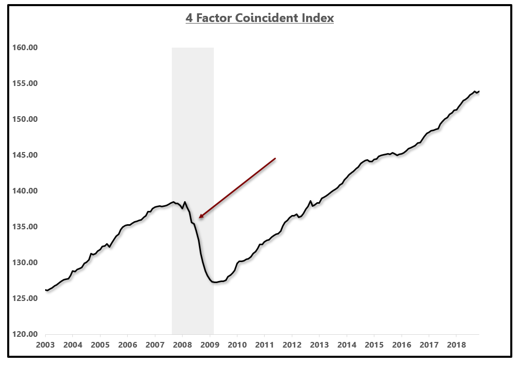
I made this assessment based on my four-factor coincident index which was constructed based on the definition of a recession from the National Bureau of Economic Research "NBER."
For more on the construction of this index, and to understand the definition of recessions more clearly, you can click here for that past research note.
Over the past two months, there has been slight downward pressure to the coincident index, namely from industrial production, but recession risk remains low at the moment.
Four-Factor Coincident Index:
 Source: EPB Macro Research
In growth rate terms, the coincident index has continued to decelerate, moving from a peak rate of 2.76% to 1.97%.
This index is not a forward-looking measure but rather a coincident reading on where the economy is at this current moment.
This index takes an aggregated measure of employment, income, production and consumption, the four critical factors of the economy. The growth rate differs from that of conventional GDP reports due to the exclusion of one-off factors such as inventory, government spending, and exports. Even though these categories are not included, the underlying demand of the entire economy is captured in these four categories.
Four-Factor Coincident Index Year over Year (%):
 Source: EPB Macro Research
While the economy is not yet vulnerable to a recession, as the growth rate of the coincident index continues to deteriorate, that risk rises.
As it stands today, the economy is empirically decelerating based on four of the broadest and most commonly used data points on employment, income, production, and consumption.
This research note will take a comprehensive and forensic dive into the sectors that are responsible for the slowdown in the economy as well as the leading indicators that will provide clarity as to whether the economy will continue to slow or improve in the months ahead.
Understanding the sequence of an economic cycle and how economic data develops is critical in your analysis of the economy. You have to understand if you are looking at leading, coincident or lagging data. Information lies in the sequence.
My hope is that at the conclusion of this note, readers find an appreciation for the comprehensive nature of this analysis as well as the process by which an economic cycle can be studied.
As the data above shows, the economy is empirically decelerating. This is not a debatable point as accelerations and decelerations are objectively measured facts - not opinions.
A debate can arise as to the strength of the economy based on the prevailing growth rate but I am only concerned with accelerations and decelerations.
A basket of my leading economic indicators predicted this deceleration in the economic data as early as late 2017 and most definitively by April 2018.
Today, as the economic data has developed, we can localize the economic slowdown to the auto sector most specifically and use various data points to predict whether this slowdown will persist or reverse.
Let's start unpacking the data.
An Update On Cyclical Sectors - Housing, Autos and Durable Goods And A Word On Sequence
An Update On Cyclical Sectors - Housing, Autos and Durable Goods And A Word On Sequence
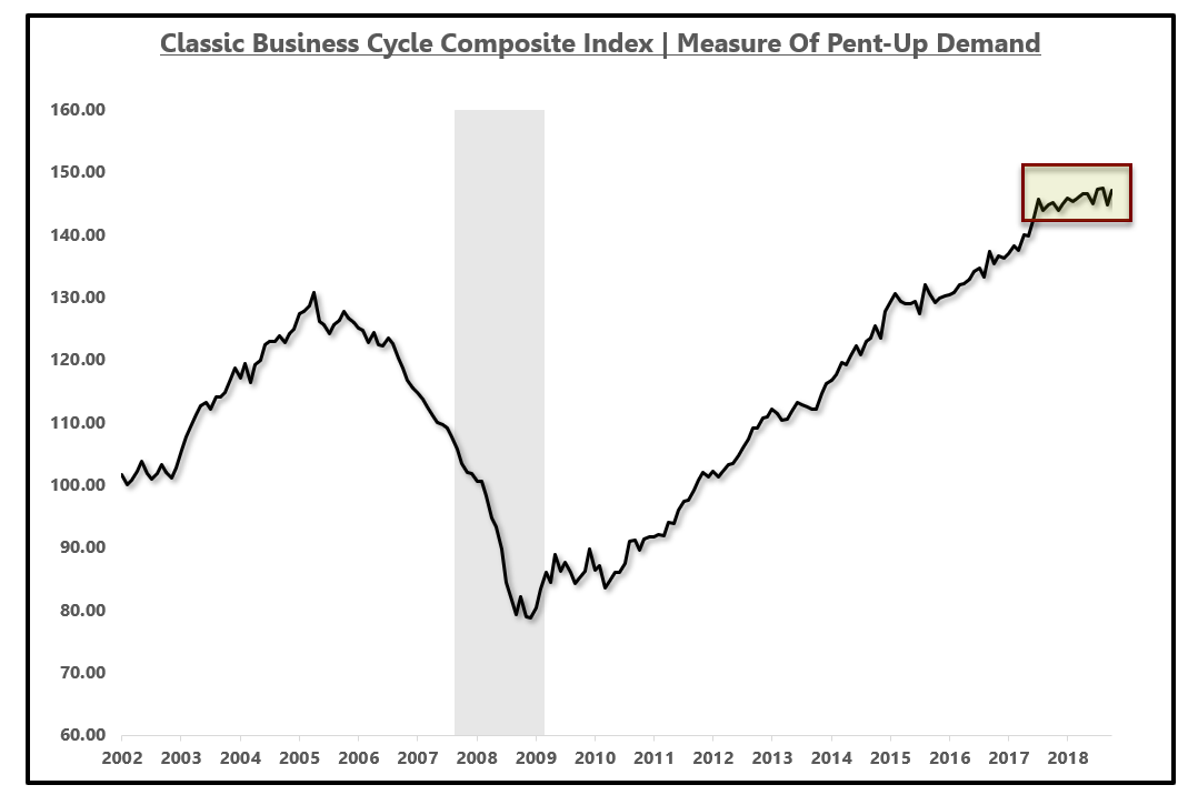
In the research note referenced above, which you can find by clicking here, I also outline my business cycle index which seeks to measure pent-up demand in the economy.
This index takes critical big-ticket data from the housing sector, the auto sector and the durable goods consumption sector. The category of durable goods includes motor vehicles and parts, household appliances, watches, jewelry, boats, airplanes and other very large, expensive items.
These items are unique because many of them are purchased with a financing option which makes increases in interest rates late in the economic cycle a headwind to big-ticket consumption.
Secondly, as mentioned, all of these items are expensive so when consumers feel stretched, they are likely to pull back first on these discretionary items.
Lastly, all of these items are subject to the economic concept of pent-up demand. This is a critical concept to understand. As governments around the world look to stimulate growth, many implement policies that in one way or another "pull demand forward." Cash for clunkers is a good example.
This works to stimulate growth in the present at the expense of future growth because once everyone has a car, there is no need for three or four cars. Once this pent-up demand becomes exhausted, which is measured in the index below, factories must deal with excess capacity, lay off production workers and close factories.
This index does not look to measure the short-term growth rate cycle but rather give an indication as to where the consumer is in terms of exhausting their pent-up demand.
This index is not near the level of contraction seen preceding the last recession, which gave a warning over two years in advance, but the growth rate has leveled off.
Business Cycle Index - Measuring Pent-Up Demand:
 Source: EPB Macro Research
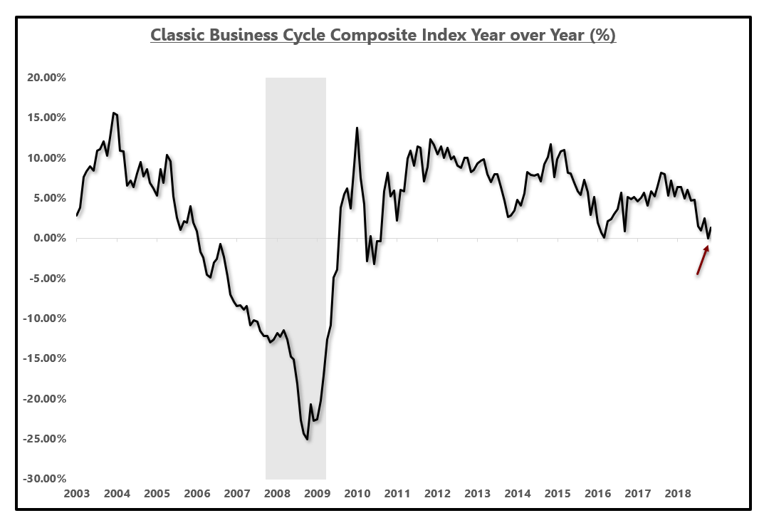
Looking at the same index, but in year-over-year growth rate terms shows that we are at one of the lowest levels of growth this economic cycle. The growth rate is not contracting but there has been a marked deceleration in growth.
I watch for this index to move into negative territory because what that indicates is that the housing sector, the auto sector, and the durable goods sector are contracting in aggregate. It is hard for the economy to move forward in a healthy way without these three critical sectors.
Business Cycle Index Year over Year (%):
 Source: EPB Macro Research
You can think of this analysis like peeling back the layers of an onion. We know that there is a deceleration in the housing market, the auto sales market and the consumption of durable goods, now we can dig deeper to find the focal point of the slowdown.
It is important to start with aggregate indices as we do at EPB Macro Research and then dig into that aggregate index to find the epicenter of the slowdown.
Once we find the epicenter, we can then get laser focused on that area of the economy and understand if the economic slowdown will persist, find the areas of the economy that the slowdown may radiate to or watch to see if the slowdown resolves itself in a "soft-landing."
The longer a slowdown lasts, the higher the probability of spreading to other areas of the economy, including the services sector which is when recessionary conditions are present.
If we dig into the business cycle index above, we can see one of the main categories, durable goods consumption has decelerated sharply.
Durable goods consumption can be found in the Personal Income & Outlays report, published by the BEA. Personal consumption represents nearly 70% of total U.S. GDP and durable goods consumption is a major subindex of that category.
We have seen durable goods consumption growth decelerate from over 9% year over year to under 1% year over year and register one of the slowest growth rates of this economic cycle.
Ignoring a major trend simply because the S&P 500 (SPY) continues to rise is a critical flaw.
While this may resolve itself in a soft landing, the chance that it does not could result in another 50% decline in your portfolio, something that has happened during the past two recessionary periods.
While this may resolve itself in a soft landing, the chance that it does not could result in another 50% decline in your portfolio, something that has happened during the past two recessionary periods.
Durable Goods Consumption Growth (%):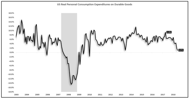 Source: BEA, EPB Macro Research
 Source: BEA, EPB Macro Research
Peeling back the onion one more time we can find what parts of the durable goods sector are driving the deceleration. The consumption of motor vehicles and parts is contracting at a rate of 4.23% year over year as of the latest report. This is down from a growth rate of nearly 10% in 2016.
Motor Vehicle & Parts Consumption Year over Year Growth (%):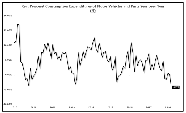 Source: BEA, EPB Macro Research
 Source: BEA, EPB Macro Research
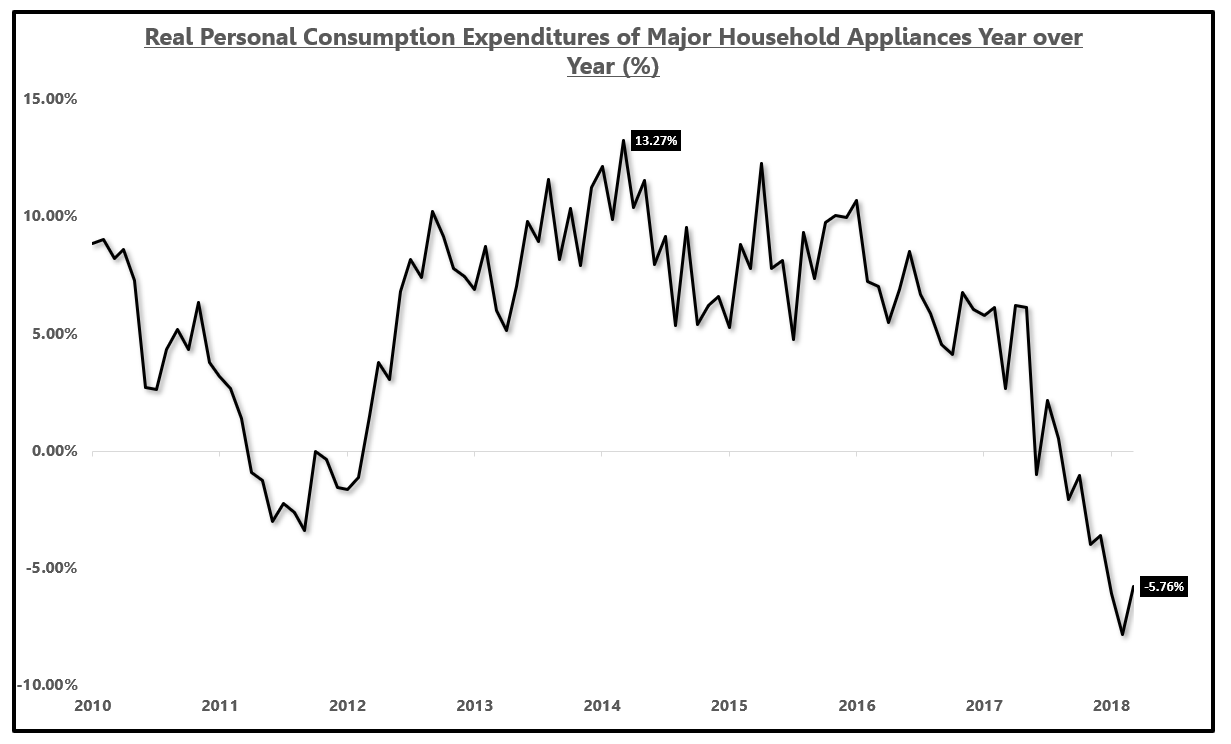
The consumption of major household appliances has fallen from 13% year-over-year growth to -6% year-over-year growth, another marked slowdown that many are choosing to ignore because for many, stocks drive the narrative rather than the fundamental data that is publicly available to all.
Housing: Major Household Appliance Consumption Growth (%):
 Source: BEA, EPB Macro Research
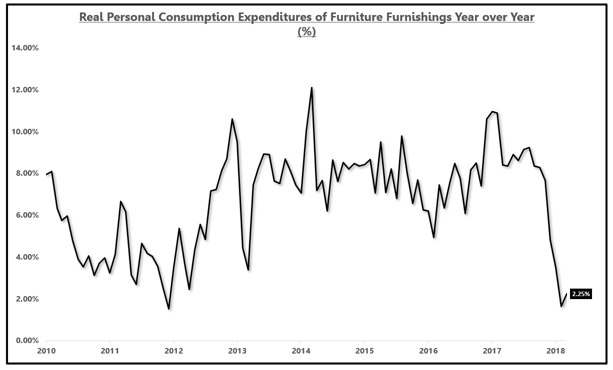
The consumption of household furnishings and general furniture has pulled back from a growth rate north of 10% to just 2.25% year over year as of the latest report.
The purpose of this is not to cherry-pick bad data but rather to understand where the empirically observable economic slowdown is emanating from.
Housing: Furniture & Household Furnishings Consumption Growth (%): Source: BEA, EPB Macro Research
 Source: BEA, EPB Macro Research
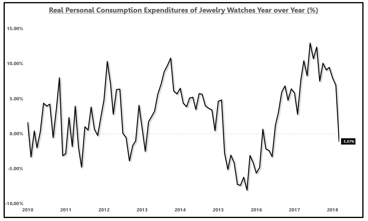
There is clearly and undeniably a consumer slowdown in progress. The growth rate in the consumption of watches and general jewelry has pulled back from a reading above 10% to a contraction of 1% year over year.
Jewelry & Watches Consumption Growth (%):
 Source: BEA, EPB Macro Research
There has clearly been a marked slowdown in consumption of various big-ticket items in the economy. The slowdown of housing, auto sales, and durable goods consumption typically proceeds broader economic contraction due to the three conditions mentioned at the start of this section.
Now a word about the sequence of data and how this slowdown starts to ripple.
Once demand falls, as it empirically has for the goods mentioned, inventory starts to build and new orders to replace inventory drop. If new orders decline, this starts to pressure the manufacturer. Many dismiss manufacturing as a forgotten industry but it is for this reason why slowdowns are always seen in manufacturing before services.
As production slows, a manufacturer will cut the hours worked of production level employees as the slowdown may prove temporary and firing and then rehiring employees is costly.
If the slowdown is not transitory, and the reduction in hours worked proves insufficient, manufacturing companies have no choice but to lay off workers which is why manufacturing employment leads services employment.
Once layoffs start, manufacturing wage growth slips and if this persists, the reduced consumption growth of a segment of the workforce has a feedback loop to the consumption of the individuals which starts a circular flow and leads to potential declines in services.
Once this cycle starts, which it already has as I will outline below, governments scramble to stimulate demand for goods to stop this process and if effective, a soft landing can be engineered.
For example, China has recently announced a measure to stimulate the consumption of new autos as the slowdown in the auto sector is a global phenomenon.
At some point, the continued stimulus measures are "pushing on a string" and unable to stop this flow.
It is for this reason, understanding the sequence of data and knowing whether you are looking at leading, coincident or lagging data is critical.
Any data point in isolation has little value but the sequence is where the information lies.
Now that we have seen a marked pullback in consumption, let's look at production and the areas of production linked to those goods mentioned above.
Has This Impacted Production?
If the pullback in consumption has been sufficient and companies are worried inventory stockpiles may be too elevated, production for new inventory will be scaled back.
For this entire analysis, we have been looking at government reports such as the Personal Income & Outlays report from the BEA, the Employment Situation report from the BLS and now, for production, we will look at the highly trusted Industrial Production report from the Federal Reserve.
All of these data sources are some of the highest quality and most trusted data available.
All of these data sources are some of the highest quality and most trusted data available.
U.S. industrial production growth has fallen by about 50% from 5.41% to 2.75% as shown in the chart below.
Industrial Production Growth (%):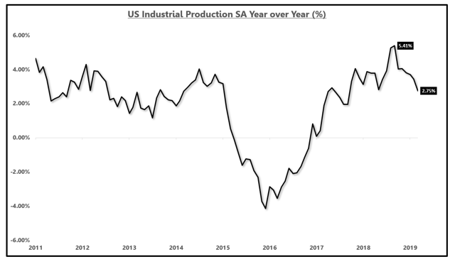 Source: Federal Reserve, Bloomberg, EPB Macro Research
 Source: Federal Reserve, Bloomberg, EPB Macro Research
 At EPB Macro Research, we never stop with the headline metric. The industrial production report is categorized by industry group, most specifically manufacturing, mining and utilities.
In the latest report, in year-over-year terms, manufacturing was the drag, increasing less than 1.0% while mining was up 10.6% and utilities were up 3.8%.
The growth rate in the manufacturing sector is running at roughly a two-year low and the production of the aggregate manufacturing sector is less than 1.0% year over year.
Industrial Production Growth Of The Manufacturing Industry (%):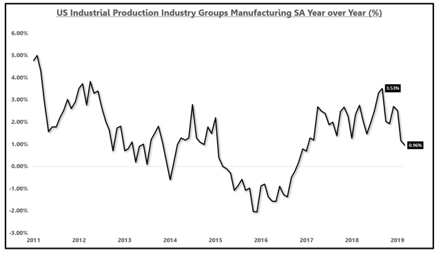 Source: Federal Reserve, Bloomberg, EPB Macro Research
 Source: Federal Reserve, Bloomberg, EPB Macro Research
Going into the manufacturing sector, we find the breakdown of durable goods and nondurable goods.
In this analysis, we are more concerned with durable goods as that category is more cyclical and contains the goods discussed in prior sections of this analysis.
The growth rate of the production of goods has also dropped by roughly 50% from 4.95% to 2.44% in year-over-year terms.
Industrial Production Growth Of Durable Goods (%):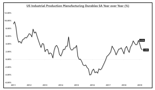 Source: Federal Reserve, Bloomberg, EPB Macro Research
 Source: Federal Reserve, Bloomberg, EPB Macro Research
What is dragging durable goods production and aggregate manufacturing lower?
Unsurprisingly, the auto sector is the main culprit declining 10.43% year over year.
It is not just the -10.43% that is alarming but the delta over the past several months.
In 2017, auto production was faltering but was "saved" by hurricane Harvey that caused a surge of new products from the damaged automobiles. This caused auto production growth to accelerate to 23.55% year over year.
After this artificial bump was over, in a matter of months we have seen a 34% delta in auto production growth, falling from 23.55% to -10.43%. There has been a marked pullback in the production of autos.
Industrial Production Growth Automobiles (%):
 Source: Federal Reserve, Bloomberg, EPB Macro Research
The other category mentioned briefly in the consumption section was the dramatic pullback in the production of major household appliances which we can see has been under pressure since 2015, now down 5.56% year over year.
Industrial Production Growth Of Major Household Appliances Growth (%):
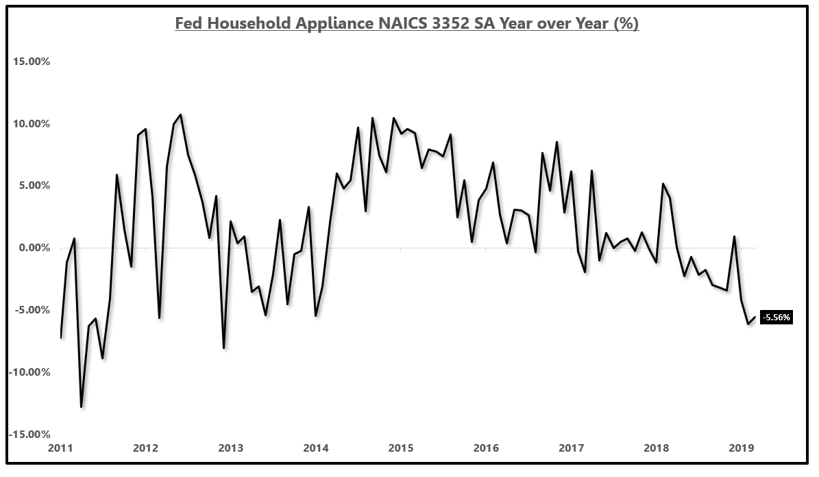 Source: Federal Reserve, Bloomberg, EPB Macro Research
If we look at a chart of both household appliances consumption on top of household appliances production, the correlation is clear.
Industrial Production Growth Of Major Household Appliances Growth (%) Vs. Consumption Growth (%):
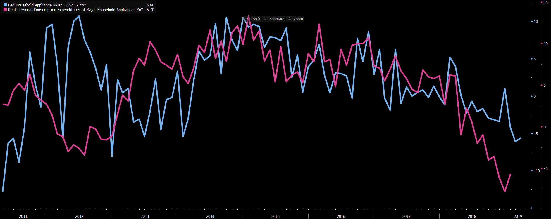 Source: Federal Reserve, Bloomberg, EPB Macro Research
To demonstrate that the auto sector is what is dragging the entire manufacturing sector lower, we can look at the special categories section of the industrial production report and note that growth actually ticked up in the latest report when looking at industrial production excluding motor vehicles and parts.
I would not even suggest that excluding the auto sector, aggregate production is decelerating.
This is not to suggest we should ignore the declines but rather to confirm the main drag is autos and also to highlight just how severe the decline in autos must be if it can turn the aggregate index from acceleration to a marked deceleration.
Industrial Production Growth Excluding Motor Vehicle & Parts (%):
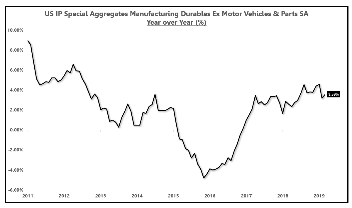 Source: Federal Reserve, Bloomberg, EPB Macro Research
As we continue to peel back the onion on the analysis of where the slowdown in the U.S. economy is radiating from, we are increasingly confident the auto sector is the main drag.
We have proved a major deceleration in the consumption of major household goods and automobiles and followed that discovery with proof that the slowdown has been pronounced enough for a pullback in production to be initiated.
Manufacturing companies are not likely to absorb lower production requests while paying employees the same rate so the next step in the sequence that we've outlined is for the hours worked of production level manufacturing employees to be reduced in response to the pullback in production.
Has This Impacted Employment?
Has This Impacted Employment?
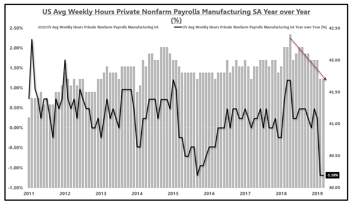
If we zero in on some key employment metrics, none of which you will hear about from mainstream analysis which only discusses the headline payrolls addition and the most misleading metric in all of economics, average hourly earnings, we can see the trends we feared in the sequence are in fact developing on cue.
The following four charts involve an analysis of the nominal weekly hours in bar chart format, as well as an analysis of the year-over-year growth rate in the weekly hours worked in the black line chart.
If we look at the weekly hours worked of production level manufacturing employees, we can see a marked decline in the nominal weekly hours worked. Furthermore, the growth rate of weekly hours in manufacturing has declined to nearly an eight-year low, a growth rate not seen since the last manufacturing decline that almost caused a U.S. recession in 2015-2016.
Average Weekly Hours Of Production Workers: Manufacturing:
Source: BLS, Bloomberg, EPB Macro Research
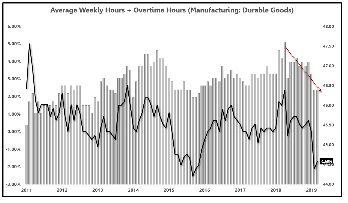
If we dig a little deeper, we can sum the weekly hours worked and the weekly overtime hours worked of production level manufacturing employees and the trend is even more clear.
Aggregate weekly hours of production level manufacturing employees (hours + overtime hours) has declined rapidly since the start of 2018 and the growth rate has fallen to -1.53% year over year.
Average Weekly Hours Of Production Workers + Overtime Hours: Manufacturing:

Source: BLS, Bloomberg, EPB Macro Research
Where is the decline stemming from? Let's peel back the onion.
Within manufacturing, we can first look at the weekly hours of the durable goods sector within manufacturing. We find that weekly hours are declining at an even sharper pace than the aggregate, down 1.69% year over year.
Average Weekly Hours Of Production Workers: Durable Goods Manufacturing:
Source: BLS, Bloomberg, EPB Macro Research
Within durable goods, unsurprisingly, one of the largest drags is the motor vehicles and parts segment which shows the average weekly hours of production level employees falling 2.23% year over year, twice the rate of the headline manufacturing index.
We see the dip in 2017 and the subsequent surge after hurricane Harvey and now the hangover effect.
Average Weekly Hours Of Production Workers: Durable Goods Manufacturing - Transportation (Motor Vehicles & Parts):

Source: BLS, Bloomberg, EPB Macro Research
After slashing the hours worked of employees 2%-4% from peak and 1%-3% year over year, if production cuts resume, the only next step is to start shrinking the workforce.
The following three charts show the monthly change in employment in bar chart format and the year-over-year growth rate in payrolls in line chart format.
For the aggregate manufacturing sector, we saw the first monthly decline in payrolls since 2017. We have also watched the year-over-year rate of change in employment decline from 2.33% to 1.66%.
One month certainly does not make a trend and the decline can absolutely be erased in the revisions to the report but the trend in the growth rate of manufacturing payrolls, lower, will not be altered.
Nonfarm Payrolls of Manufacturing (Monthly Change) & Year-Over-Year Change (%):
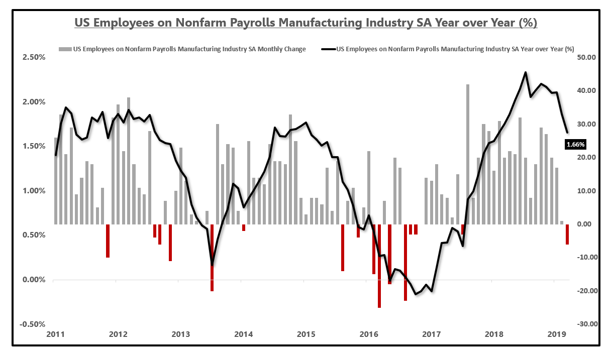
Source: BLS, Bloomberg, EPB Macro Research
Going into the subcategories, durable goods employment has seen an even sharper decline in the year-over-year change in payrolls additions. Durable goods payrolls growth saw a decline last month and a year-over-year deceleration from 3.15% to 2.07%.
Nonfarm Payrolls For Durable Goods Industries:
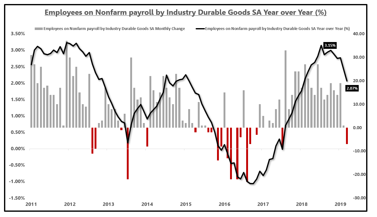
Source: BLS, Bloomberg, EPB Macro Research
If we arrive at the employment section of motor vehicles and parts, we see a monthly decline but a very marked deceleration in the growth rate of payrolls.
There is the 2017 dip before the hurricane Harvey spike but we now see motor vehicle payrolls almost contracting year over year. There has been a 5% delta in the year-over-year change, falling from 5.13% to 0.35%.
Nonfarm Payrolls For Durable Goods Industries Motor Vehicles:
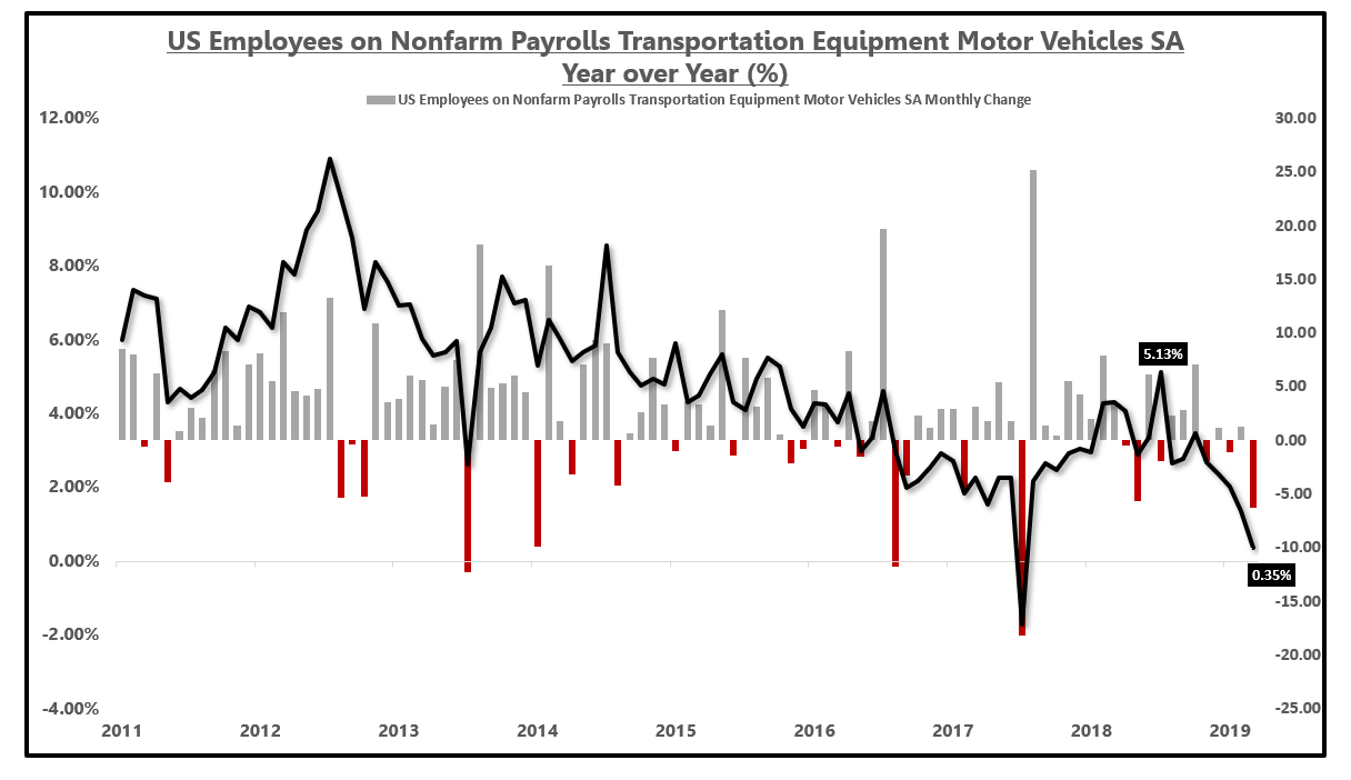
Source: BLS, Bloomberg, EPB Macro Research
Why is this important?
The auto sector is clearly starting to decelerate at a faster pace and it is having an impact on the headline numbers. The purpose of showing the headline numbers was to demonstrate how a slowdown concentrated in one sector can absolutely impact the aggregate.
Also, if a slowdown in the auto sector continues, and gets worse, we will see more employment losses in this category which will have a feedback loop to income and broader consumption.
That is what we have to look for as it pertains to a broader and more deleterious slowdown.
If you think this hasn't impacted income already, think again. Let's take a look.
The Feedback Loop To Income
The metric I use for income growth comes from the Personal Income and Outlays report from the BEA, not the average hourly earnings report from the BLS which is the absolute worst number in all of economic analysis.
Average hourly earnings is a ratio, not a number, which can rise if both the numerator and the denominator both shrink. Think about that.
If you earn $100 in 10 hours, you are earning $10/hour. If your income shrinks to $90 and your hours worked drops to 1 hour, you are earning $90/hour. Average hourly earnings growth soars but you have less to contribute to the economy and the Fed is supposed to raise interest rates in this scenario?
Also, average hourly earnings have zero correlation to consumer spending and often rises in the dead middle of a recession.
It is mind-boggling that anyone still uses this measure.
Looking at the chart below shows the metric I use, wages and salaries from the BEA and average hourly earnings "AHE" from the BLS.
Wages and salaries growth (green) declines into the recession as it should and bottoms in the recession, accelerating into the economic expansion.
AHE growth spikes in the dead middle of the recession due to hours worked falling faster than weekly earnings and bottoms three years into the expansion.
The Fed was supposed to raise rates in late 2008 because "wages" were spiking? This is a horrible analysis and a misleading metric that everyone should throw out of their tool kit.
Wages and salaries disbursements from the BEA correlates strongly to consumer spending and measures actual wage growth in the economy.
Why Use A Flawed Measure?
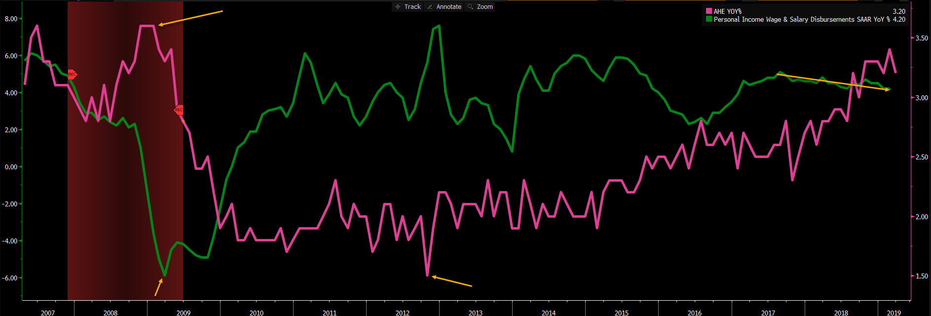
Source: Bloomberg
With that out of the way, using wages and salaries, adjusted for inflation, we can see wage growth lower than the peak in 2014 (which came with 3.8% year-over-year GDP growth) but steady at roughly 2.9%.
Real Wages & Salaries Growth (%)
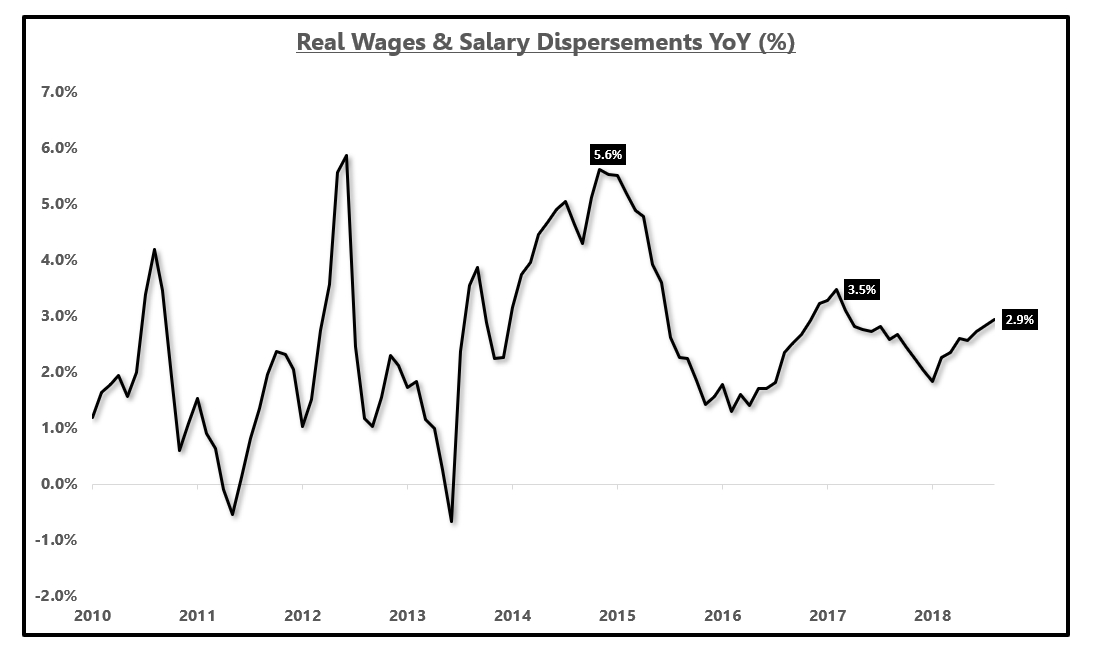
Source: BEA, Bloomberg, EPB Macro Research
Wage growth has been flat for almost four years which is why real personal consumption expenditures, 70% of GDP, has been flat for four years.
If wage growth was truly accelerating, why is 70% of the economy, consumption, flat in growth rate terms?
The acceleration in GDP growth has clearly not been a factor of the consumption sector (70% of GDP), but rather government spending, inventory, and exports.
Real Personal Consumption Year Over Year (~70% Of GDP):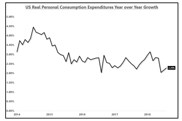 Source: BEA, EPB Macro Research
 Source: BEA, EPB Macro Research
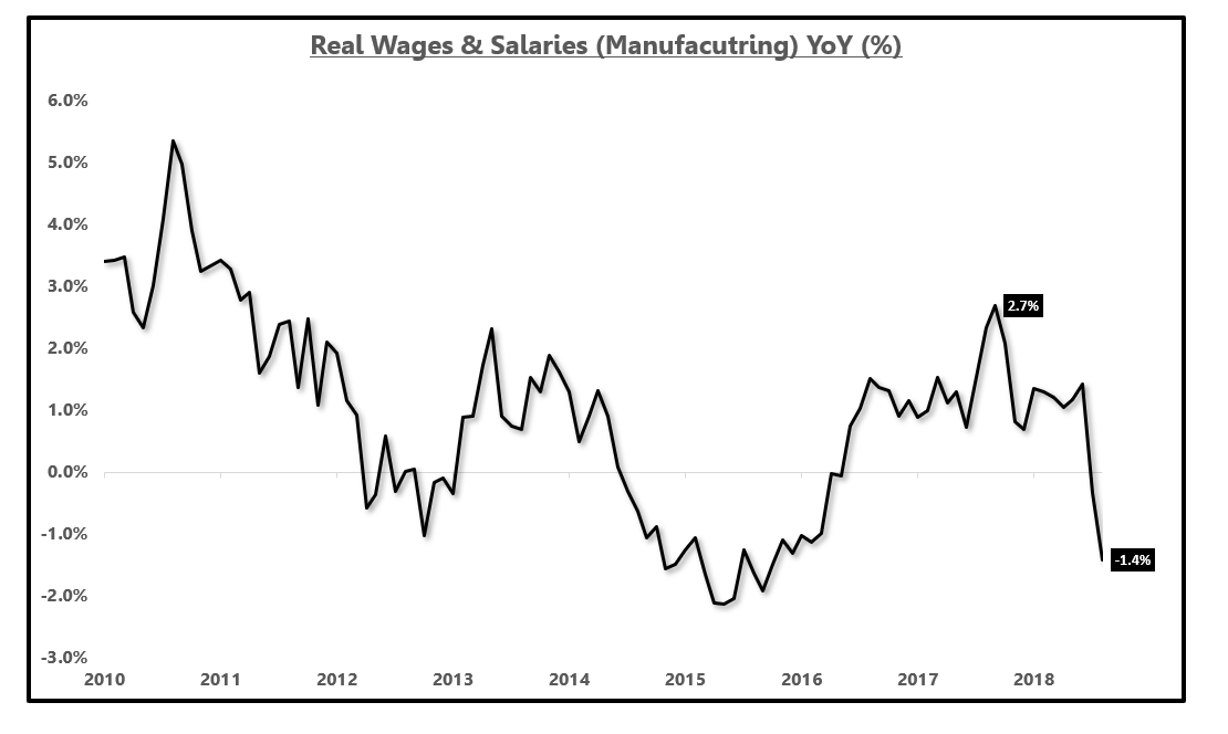
With that rant out of the way, in the wages and salaries report from the BEA, we can look at manufacturing wages.
Adjusted for inflation, we are seeing a contraction in manufacturing wages, falling 1.4% year over year.
This is why the slowdown in the manufacturing sector and the auto sector more specifically cannot be ignored.
If this slowdown does not reverse and gets worse, manufacturing payrolls will remain in contraction which will eventually have an impact on national wage growth and the already flat to decelerating national consumption metric (70% of GDP).
Real Personal Income Growth For Manufacturing (%)
Source: BEA, Bloomberg, EPB Macro Research
If consumption growth, outlined one chart above, continues the downward trend, how can economic growth move higher without the help of another round of government spending, inventory accumulation or one-off factors that work to undermine long-term growth?
The numbers simply do not add up for those in the camp of perpetual 3% year-over-year growth.
While the share has been shrinking, goods production wages (including manufacturing) accounts for 16% of total wages in the economy.
It is just not correct to suggest that manufacturing wage growth in decline will not adversely impact broad national consumption, should this slowdown persist at the current pace or deteriorate further.
Conclusion And Where To Get More Information On Cycles
The purpose of this analysis was two-fold. First, it is highly critical to objectively understand the economy is, in fact, in a state of deceleration despite what the equity market may imply.
Then, digging into the slowdown to find exactly where the slowdown is radiating from. Once this is discovered, we now know where to focus our attention as it pertains to a possible soft-landing or if this slowdown will get worse.
Secondly, the purpose was to show just how dramatic an impact just one sector can have on broader economic numbers.
It should be very clear at this point that the U.S. economic slowdown is stemming from the manufacturing sector and the auto sector more specifically.
It should also be clear that underlying economic growth (70% of the economy) has not accelerated since early 2015 despite the headline numbers rising off government spending, inventory, and exports.
Should the slowdown in this area of the economy continue, and the ancillary effects such as deteriorating wage growth in the manufacturing sector continue, broader consumption, housing, and economic growth will suffer.
Understanding the sequence by which economic data and economic cycles unfold is critical to macroeconomic analysis. Looking at any data point in isolation is of little value but when the sequence lines up, small changes can be very telling.
Interest rates on both the long-end of the curve (TLT) and the short-end of the curve have been declining since late 2018 as a result of this empirically observable slowdown in economic growth, concentrated in manufacturing and autos.
We can argue whether this slowdown will continue or reverse but we cannot argue the fact that growth is decelerating.
My goal as an economic cycle analyst is to spot inflection points in the economy. When an economy is trending, both accelerating and decelerating, most analysts can provide an opinion because linear models will look effective.
Inflection points are not linear and this is why everyone gets caught offsides at inflection points and loses 20% to 50% of their money in risk assets like in December.
The drawdown in December was a result of a major economic inflection point that we spotted at EPB Macro Research over eight months earlier.
If you want to avoid major drawdowns that come at important inflection points, or back-up the truck on stocks coming out of a major downturn, you need to have a macro edge and you need to have the ability to spot critical inflection points.
How Can You Spot Economic Inflection Points?
EPB Macro Research uses composite leading indicators and a wide range of economic data to properly prepare for inflection points in the economic cycle.
The most opportunity and the largest changes in asset prices occur during positive and negative economic cycle inflection points.
The consensus is consistently offsides at major turning points.
0 comments:
Publicar un comentario