U.S. Economy - Slip-Sliding Away
By Pater Tenebrarum
It must be China. Or the weather, which is usually either too cold or to warm - somehow the weather is just never right for economic growth. Surely, it cannot be another Fed policy-induced boom that is on the verge of going bust? Sorry, we completely forgot - the Fed is never at fault when the economy suffers a boom-bust cycle. That only happens because we have "too few regulations" (that's what Mr. Bernanke said after the 2008 bust - no kidding).

Photo credit: Matthew Emmett
No matter what economic data releases one looks at lately, one seems more horrendous than the next.
This is apart from payrolls of course, which are not only a lagging indicator, but are apparently a number that is occasionally made up out of whole cloth - such as in December, when 281,000 of the reported 292,000 in non-farm payroll gains were the result of "seasonal adjustment", which is bureaucrat-speak for "didn't actually happen".
Today, the markets were inundated with data that strongly suggest that the negative trends observed over much of 2015 continue to accelerate. In what is by now a well-worn tradition, Fed district surveys of the manufacturing sector continued their decline with today's release of the Empire State survey. One no longer risks being accused of hyperbole by calling its recent trend a "collapse":
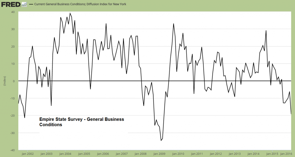
Empire State Survey, general business conditions index. Such readings are usually not seen during economic expansions.
As is often the case, not a single economist came even remotely close to correctly forecasting this meltdown. As Mish noted earlier today, it was quite a big miss:
"The Econoday Consensus estimate was for a slight improvement to -4 from a November reading of -4.59. The actual result was -19.37 with the lowest economic estimate -7.50."
Our friend Micheal Pollaro has provided us with several charts, including the following comparison chart, which shows the Empire State survey's new orders index for January, as well as the new orders index of the National ISM and the average of the new order indexes of the Fed district surveys as of December. Not only are new orders one of the most important components of such surveys, as they lead future manufacturing activity, but in recent months the Empire State new orders index has begun to lead other survey data. If it continues to work as a leading indicator, one should expect more negative data points to be released in the near future.
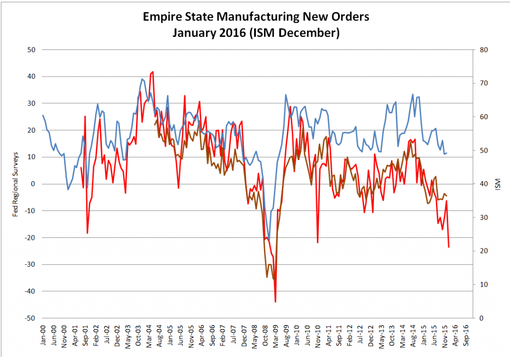
New order indexes: Empire State (red line, for January), average of all district surveys (brown line, as of December) and ISM (blue line, as of December, rhs).
Admittedly, this is an especially volatile regional survey, so it is probably not useful as decisive evidence for a broader economic downturn, but every other data points released today proved to be a disappointment as well. The industrial production index has also continued its decline in December.
Industrial production was down 0.4% in for the month (3.4% y/y) and the November reading was revised lower to minus 0.9%. In this case, no mainstream economist managed to forecast any of this either. It is noteworthy that readings similar to the current ones have never been recorded outside of recessions in the post WW2 period. Here is a chart showing developments since 1970:
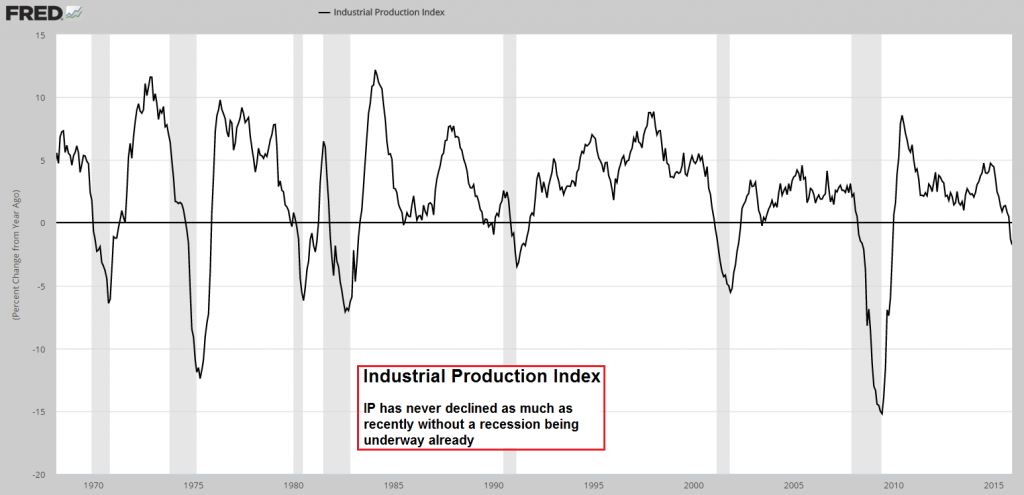
Industrial production declines further. Keep in mind that NBER is backdating the beginning of recessions once they are six months old or older. This means that a recession is never officially recognized when it actually begins. In other words, a recession may have begun already; we will only know for sure a few months down the road.
It is quite funny that the failure to forecast the decline in IP was once again blamed on the weather. The credibility of that excuse is really beginning to wear thin - are economists as a group unaware of the weather? What was it about the weather that hindered industrial production this time? Apparently, it was too warm. One might be tempted to conclude that it is the mere fact that weather as such exists that is the problem here, but the reality is of course that forecasts of specific economic data down to 10ths of percentage points are essentially a waste of time. One might as well toss a coin.
But surely December retail sales would come in at a reasonably good level? No luck on that score either, although this weak report (down 0.1%) was actually the best of the day. This time expectations were only slightly undercut, but there were large declines in a broad range of sub-sectors, all of which normally tend to do well in the Christmas season.
Lastly, the Census Bureau reported business sales and inventories for November, with the slide in sales continuing - inventories declined by 0.2% on month-on-month, but were still up 1.6% from a year ago. Sales declined at a similar pace month-on-month, but were down 2.8% from a year ago. As a result, the inventory-to-sales ratio remained stuck at its recent interim high - which is still the highest level since mid 2009. Mid 2009 wasn't a particularly happy time for the economy.
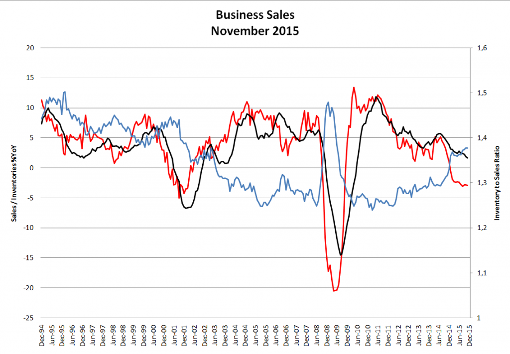
Business sales (red line) and inventories (black line) and the inventory-to-sales ratio (blue line, rhs).
Negative stand-out in terms of business sales were wholesalers' sales, which have declined by 5% year-on-year as of the end of November. Inventories are declining as well (m/m), but not fast enough yet - the inventory-to-sales ratio of this sub-sector has consequently made a new high for the move:
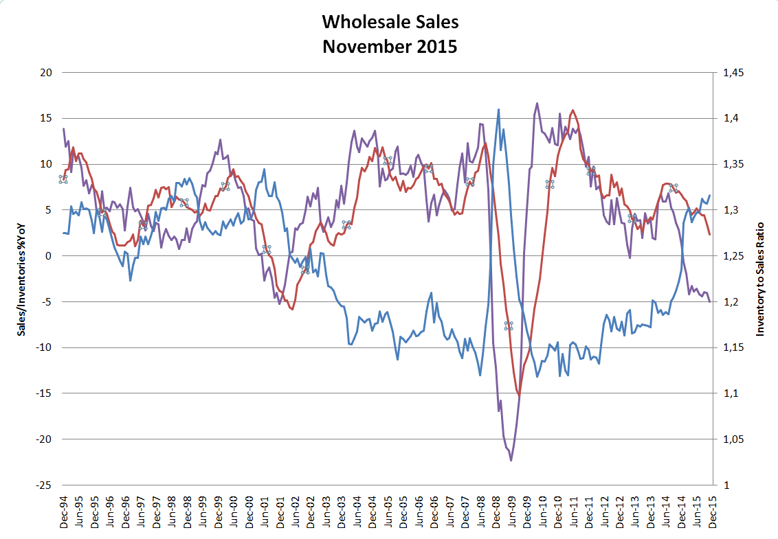
Wholesalers: y/y change rate in sales (purple line), inventories (red line) and the inventory-to-sales ratio (blue line, rhs).
Selected Other Indicators
While we have no new update yet on charge-offs and delinquencies in the commercial and industrial sector, it should be noted by way of reminder that this is yet another datum that is consistent with an incipient recession (the data are as of Q3):
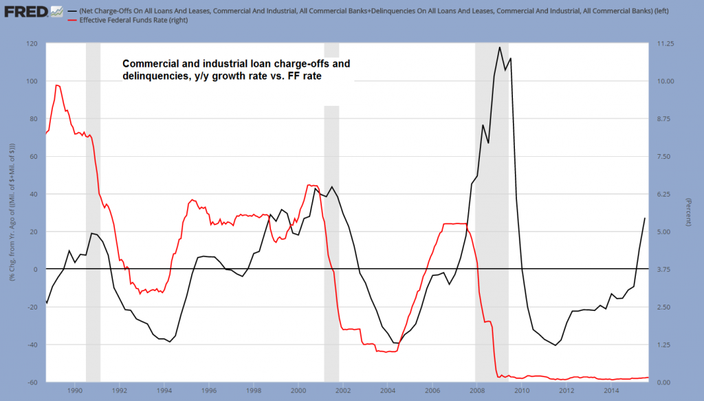
The sum of C&I loan charge-off and delinquencies vs. the FF rate.
Junk bonds have continued to decline - with yields reaching new highs for the move on Wednesday and improving by just one basis point yesterday. In light of today's carnage in risk assets, with junk bond ETFs once again falling sharply, it can be safely assumed that yields have yet again reached new highs today. As always, the lowest-rated bonds are the worst performers, but even the Master Index II effective yield has by now nearly doubled from its late June 2014 low. Energy debt plays a big role in these moves, but in the meantime the weakness has begun to spread to other sectors as well:

Junk bond yields keep surging.
Lastly, our coincident boom-bust indicator, the ratio of capital equipment to consumer goods production, remains at quite an elevated level. This suggests that if a bust has indeed begun, it is only in its beginning stages.
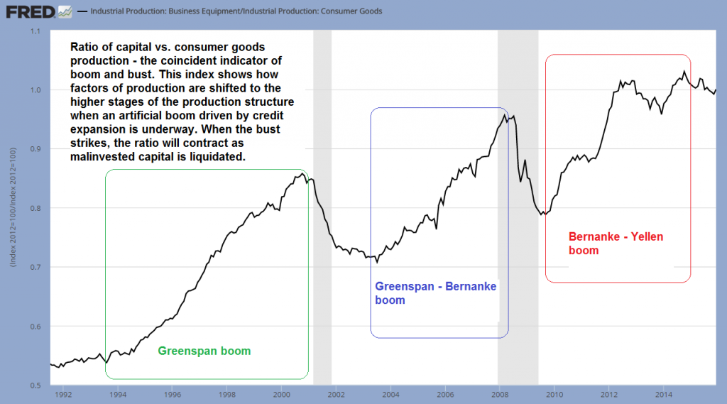
Three booms induced by loose monetary policy, as seen in the ratio between capital and consumer goods production.
The ratio of capital equipment to consumer goods production gives us a rough idea toward which stages of the production structure the bulk of investment is flowing. Just as capital theory suggests, during times when interest rates are artificially suppressed and the money and credit supply are expanding, the higher stages of production (capital goods producing industries) attract a greater level of investment and display more activity relative to the lower stages (consumer goods).
However, this can never work out in the long run, as production is ultimately not funded by "money", but by real capital, i.e., by real savings. It is impossible to print the economy to prosperity and these artificial booms are therefore never sustainable. The denouement of the boom can be delayed by keeping monetary policy loose for longer, but such delaying tactics will as a rule merely worsen capital consumption and hence the subsequent bust. The chart above is telling us that more society-wide impoverishment definitely awaits.
Conclusión
Everything continues to suggest that the economic recovery is in the process of screeching to halt.
The recovery was already the weakest of the post WW2 era to begin with. Only one datum still gives us pause, and that is the rate of growth of the broad true money supply TMS-2, which has seen a rebound to approximately 8% year-on-year in November.
On the other hand, the annual growth rate of narrow money M1 has reached a new low for the move of 4.65% in mid-December, compared to a peak reading of approx. 24.6% attained in October of 2011. While this volatile series has rebounded sharply between mid December and early January (to 9.5%), the effects of changes tend to arrive with a considerable lag. We continue to suspect that it will lead the broader measure TMS-2 lower as well.
Lastly, the stock market, oversold as it already was, proved unable to withstand today's onslaught of data and proceeded to fall out of bed completely. At one point the DJIA was down more than 500 points. By the close it had recovered to a loss of 390 points, which is still quite hefty. As we noted yesterday in this context: "[An] oversold market can easily become more oversold when it keeps being inundated with evidence that economic conditions are not what they were thought to be."
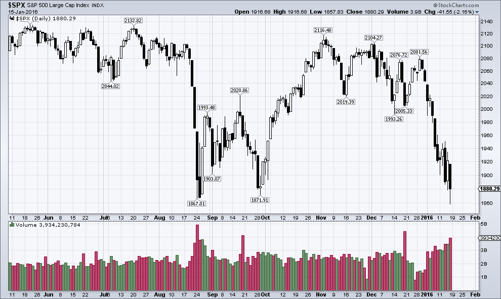
The S&P 500 Index bounces after briefly undercutting the August 2015 low by a mere seven points.
This level seems ideally suited for a rebound to begin, but at the same time, it remains uncomfortably close.
Based on technical grounds, we still believe that the market is likely close to a short-term rebound, but keep our recent warning in mind: Sharp declines during usually seasonally strong periods are a typical bear market characteristic. In fact, as Jason Goepfert reports, the recent combination of market moves has only been seen in the vicinity of a handful of major historic market tops.
Note that Mr. Goepfert's observations are independent from what we said about seasonal patterns. If we add the occurrences of past warning signals given by unusual seasonal cycle inversions to his list, we find a few overlaps, as well as additional examples (namely 1962, 1973, 2001, 2007, 2008 and Tokyo 1990 - there may be a few more examples for this, but these are probably the most prominent ones). In connection with the economy, the relevance of this consists of the fact that a putative bear market ("officially" the market is merely in a strong correction so far) would almost certainly go hand in hand with a recession.
Charts by: St. Louis Federal Reserve Research, Michael Pollaro, StockCharts
0 comments:
Publicar un comentario